Meta · Facebook · 2025-2026Facebook personalization:
Helping AI understand what people actually mean
At a glance
The challenge
AI couldn't reliably infer user intent from behavior alone.
Approach
Built a scalable explicit-feedback framework that transformed ambiguous engagement into structured intent signals.
Impact
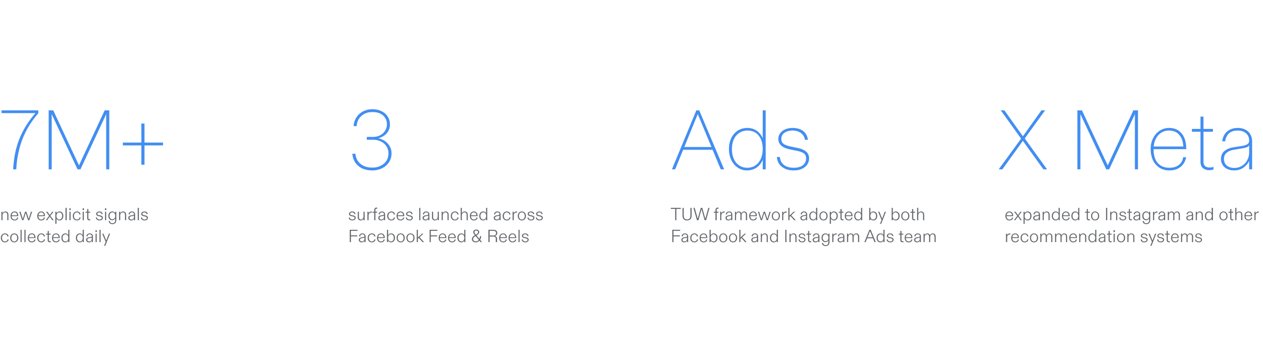
Established a new personalization paradigm that combines implicit signals and explicit signals, helping AI better understand user intent while generating 7M+ new signals daily and scaling across Meta's recommendation and advertising systems.
The problem
Recommendation systems are excellent at collecting behavioral signals — but the same behavior can mean very different things.
We were optimizing recommendations on behavioral signals while missing the user's actual intent. Over 60% of people said they struggled to find content they wanted to see.
How might we help the system understand intent — without putting the burden on users?
My role
I partnered closely with Content Design, UX Research, Feed Ranking, and Integrity teams to ensure every design decision balanced three tensions: giving users meaningful control, preserving signal quality for ranking models, and keeping the experience simple enough that people actually use it.
As a Product Designer, I owned the end-to-end experience design for Facebook's Personalization feedback framework. I drove the strategy, interaction model, and visual design across five experiment cycles, from initial concept through public launch.
The approach
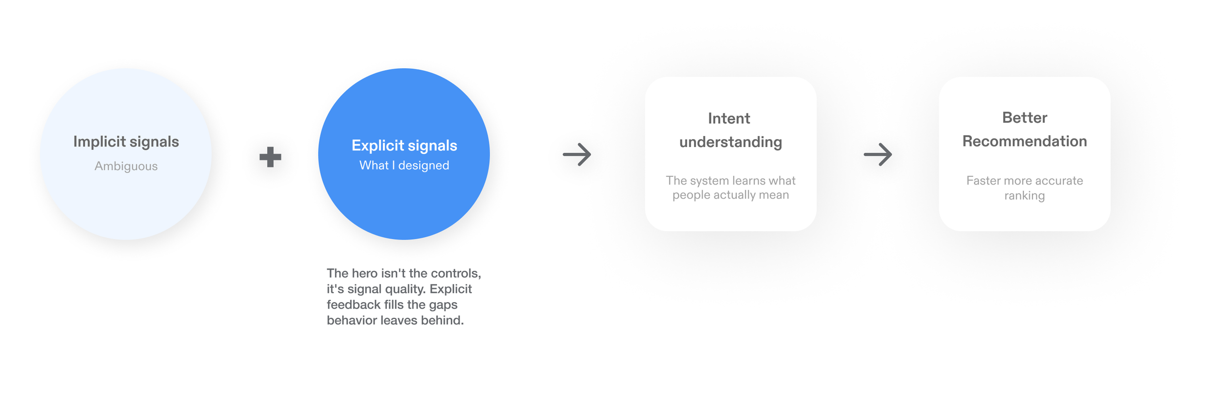
A signal ecosystem, not a settings page
The answer wasn't more controls — it was a better signal. Pair the behavior the system already sees with explicit input that resolves what it means.
Building the signal ecosystem
Rather than designing isolated personalization features, I designed a signal ecosystem where each interaction contributes a different piece of user intent, enabling AI to learn more accurately over time.
Deep dive
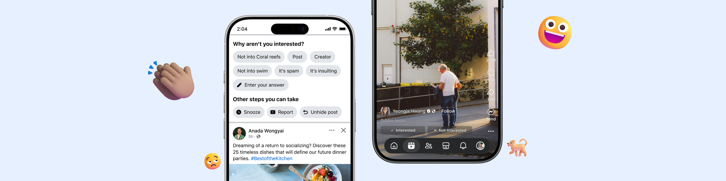
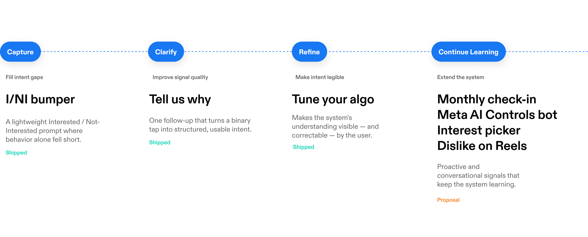
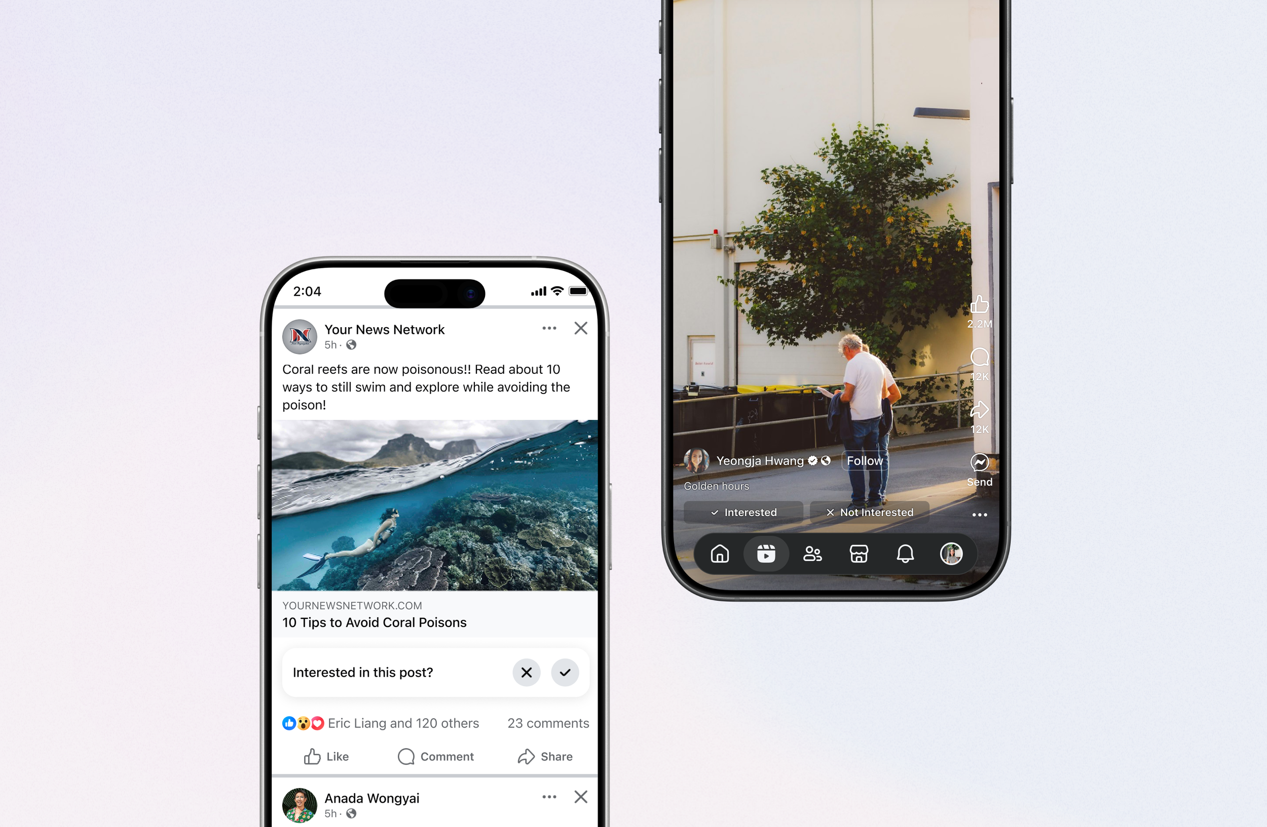
I/NI bumper
Filling the gaps behavior leaves
Shipped
Problem
Existing behavioral signals over-indexed on engagement and under-represented preference — leaving ranking with blind spots exactly where it mattered most.
Design decision
I introduced a lightweight explicit signal at the moments where behavioral inference was weakest — a single Interested / Not-Interested binary, inline at the point of consumption. Visible enough to collect signal, quiet enough not to intrude, and identical across Feed and Reels, two very different consumption patterns.
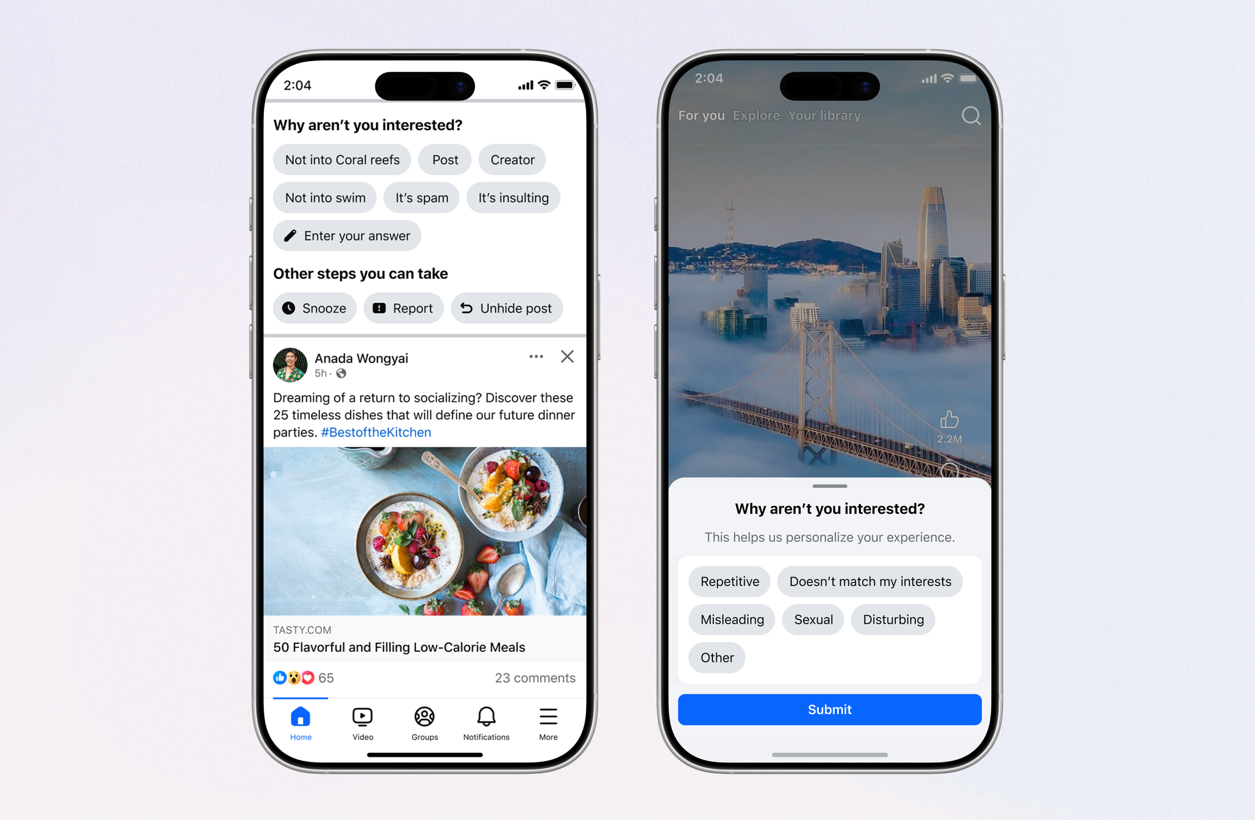
Tell us why
Turning an ambiguous tap into structured intent
Shipped
Problem
A Not Interested tap told us that someone wasn't interested—but not why. The same action could mean low quality, repetitive, political, or simply "not right now," leaving the ranking system to guess a user's true intent.
Solution
I partnered with Ranking, Research, and Content Design to define a shared intent taxonomy and transform one ambiguous action into lightweight, structured feedback. Through rapid experimentation, we balanced richer signals with minimal user effort, creating a scalable framework that improved signal quality while remaining simple enough to adopt across Feed and Reels.
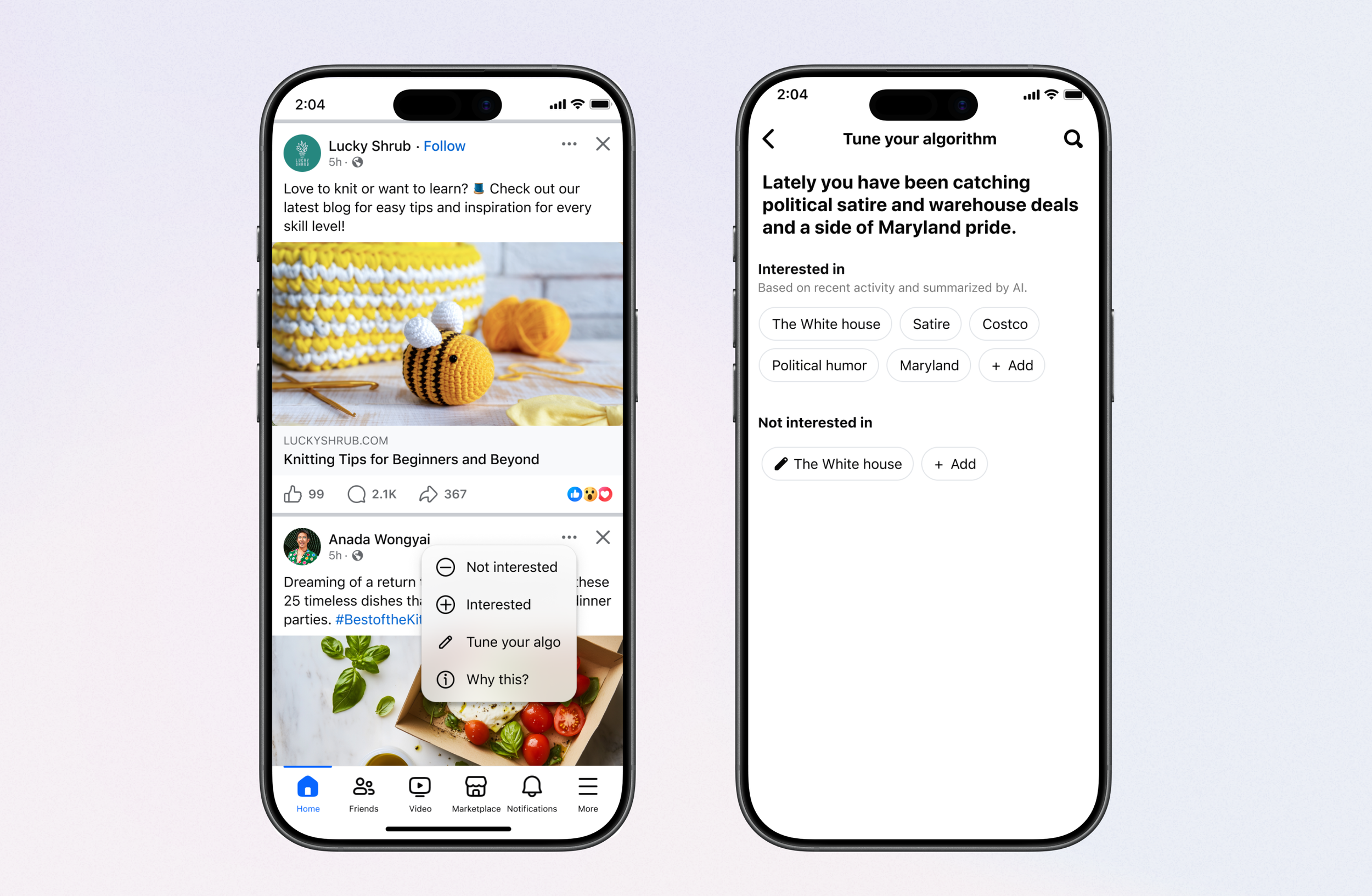
Tune your algo
Making AI's Memory Visible
Shipped
Problem
AI continuously learned from user behavior and feedback, but people couldn't see, verify, or correct what it believed about them.
Solution
Created a persistent preference hub where users can inspect, edit, and reinforce the AI's understanding over time.
Connected every explicit signal—from TUW and future feedback systems—into a single, evolving model of user preferences.
Impact
17.4K daily activities managed their preference here.
Created the first persistent destination for explicit preferences. Unified signals collected across multiple feedback surfaces.
Made AI's understanding visible and editable. Increased user agency and transparency.
Became the foundation for future AI-generated interests and preference management.
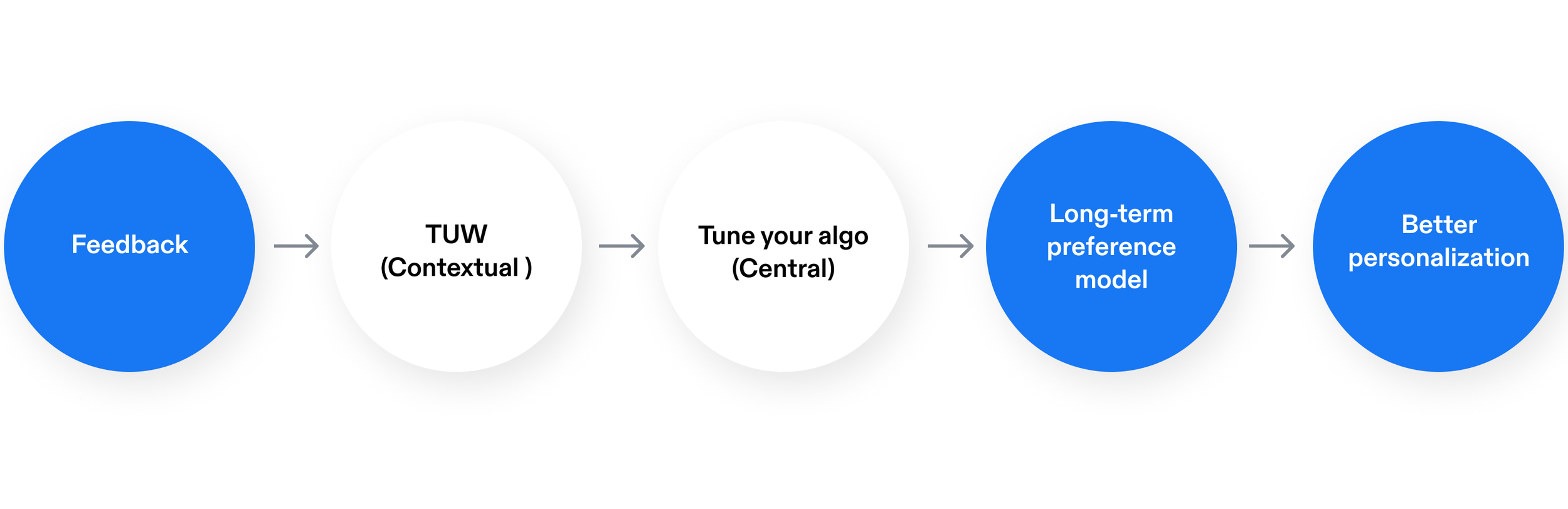
Framework
All explicit feedback funnels into a persistent preference profile that powers future recommendations.
A shared foundation that other teams could build on
The framework became a shared foundation across Feed, Reels, Settings, and Ranking.
Extending the system
Interest picker
Seeding intent before the system has to guess
Proposal
Problem
New and low signal users have no history, so ranking cold-starts by guessing — right when a weak feed loses people.
Solution
A lightweight, positive-signal-first moment where people pick what they're into, so ranking starts from real intent instead of inference. I explored two forms: a one-page picker in onboarding for the cold-start, and an inline picker in Feed that lets existing users top up their signal without leaving the scroll. Quick to use, never homework.
Monthly check-in
Personalization you revisit, not set and forget
Proposal
Problem
New and low signal users have no history, so ranking cold-starts by guessing — right when a weak feed loses people.
Solution
A lightweight, positive-signal-first moment where people pick what they're into, so ranking starts from real intent instead of inference. I explored two forms: a one-page picker in onboarding for the cold-start, and an inline picker in Feed that lets existing users top up their signal without leaving the scroll. Quick to use, never homework.
Dislike on Reels
Covering the system's biggest blind spot
Proposal
Problem
Reels is roughly 75% of consumption but the weakest signal surface — there's almost no persistent way to say "not this." And it's not an oversight: Reels deliberately avoids active negative feedback, because a visible dislike risks reading as judgment of the creator rather than input to the algorithm. So the largest source of behavior produces the least explicit intent.
Solution
A negative signal designed to read as "shape my feed," not "down-vote this person." The feedback is aimed at the algorithm, not the creator — framed and placed so it never feels like a verdict on someone's content. It turns the platform's biggest blind spot into a first-class source of ranking signal.
Vision
From controls to conversation, Meta AI as a personalization concierge
Today's systems ask people to navigate settings. Tomorrow's will understand intent through natural conversation. A single AI surface for all personalization — not just chat, but action. Say what you want; the system understands, acts, and learns.
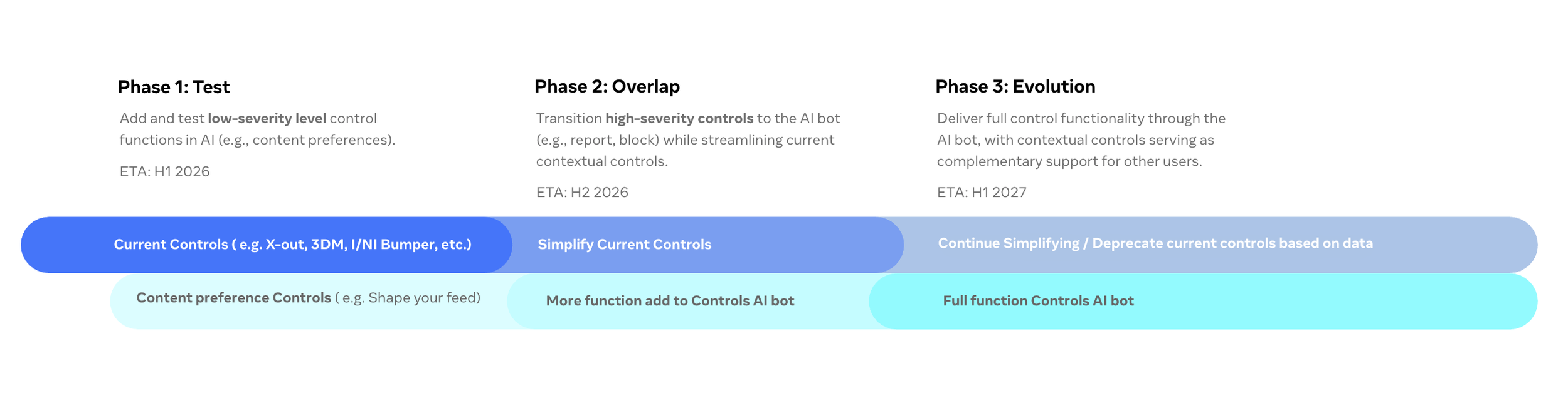
Severity-graduated rollout
Start with low-severity controls, where a wrong guess costs little and the model can learn safely. As trust builds, graduate to higher-severity actions where the tolerance for error is lower.
What I learned
Great AI products aren't built by collecting more signals, they're built by helping AI understand the right signals.
Behavioral signals will always be the foundation of personalization. My role as a designer wasn't to replace them, but to identify where thoughtfully designed user input could resolve ambiguity, improve learning, and ultimately reduce the need for explicit feedback over time.
The future of personalization isn't giving users more controls—it's building AI that needs fewer controls because it understands people better.
Principles I'll Carry Forward
1. Design the learning system, not just the interface.
Every interaction should improve both the user experience and the system's understanding. The best controls don't just solve today's problem—they make tomorrow's recommendations better.
2. Signal quality is a product problem.
Understanding intent isn't just an ML challenge. Product design determines when, how, and why users choose to provide meaningful feedback.
3. Alignment scales better than features.
The biggest leverage came from creating a shared personalization framework that multiple teams could adopt—not from any single UI.
Notice how every principle starts with a bold, memorable statement.
These are quotable.
Looking Ahead
Invest in positive preference signals earlier to understand what users value, not just what they reject.
Unify personalization controls sooner around a single mental model instead of evolving them independently across surfaces.
Explore conversational AI earlier as a lower-friction way to capture intent while reducing reliance on explicit controls.