Design reflection · 2022-2026My Design Life at Facebook
I use my creativity to make positive social impact; I want to bring users the content they want to see. I want to bring peace of mind to the parents when their teens are on social media. I want to give every person, not just the loudest or most technical — a real voice in how the algorithm shapes their world.
That's the thread that runs through everything I do at Meta, where I'm currently a design lead on Facebook. Much of this work can be summed up in three themes: Social Impact, Curiosity, and Obsession.
This is part reflection, part portfolio. I've designed privacy systems and parental supervision tools, and now I lead personalization design on Facebook — creating the features and concepts that help people feel like the platform is truly theirs.
01 / Social impact
Design should empower people, especially when the systems around them are complex, opaque, or just not built with them in mind.
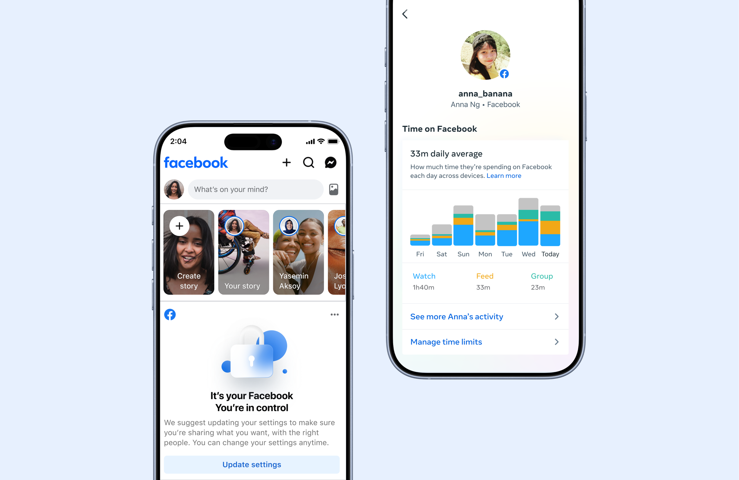
Facebook Privacy & Parental Supervision: The Foundation
My earliest Meta work was designing the Facebook Privacy system — making privacy comprehensible and actionable at a scale where the wrong default affects billions. It was the first time I felt design directly translate into positive social impact: giving people real control over something that matters.
That continued with Facebook Parental Supervision — designing the tools that help families navigate the internet together. You can't just give parents a dashboard of controls. You have to design something that respects both the parent and the teen — something that brings peace of mind without breaking trust.
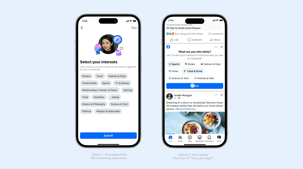
Pinterest Picker: let people choose what they want to see.
Most personalization work is reactive — users tell us what they don't want after they've already seen it. Interest Picker flips that. It's a proactive, positive-signal-first experience that lets people shape their feed from the start.
We designed two explorations: a one-page picker integrated into the Facebook onboarding flow, and an inline picker that appears directly in Feed. Both are lightweight — the goal is to gather preferences quickly without making it feel like homework.
For South Ease Asian teens specifically, we designed a Video Interest Picker that collects preferences while they're already browsing. It serves a dual purpose: improving content relevance while proactively filtering out content that could be age-inappropriate. This is personalization as care — not just "show me more of this," but "keep me from seeing things I shouldn't."
For new or low-signal users — especially the people who never touch the 3-dot menu — an Interest Picker might be the single most impactful thing we can design.
02 / Curiosity
The what-ifs. What if preferences evolved over time? What if calibration was a game? What if the social graph could curate your world for you?
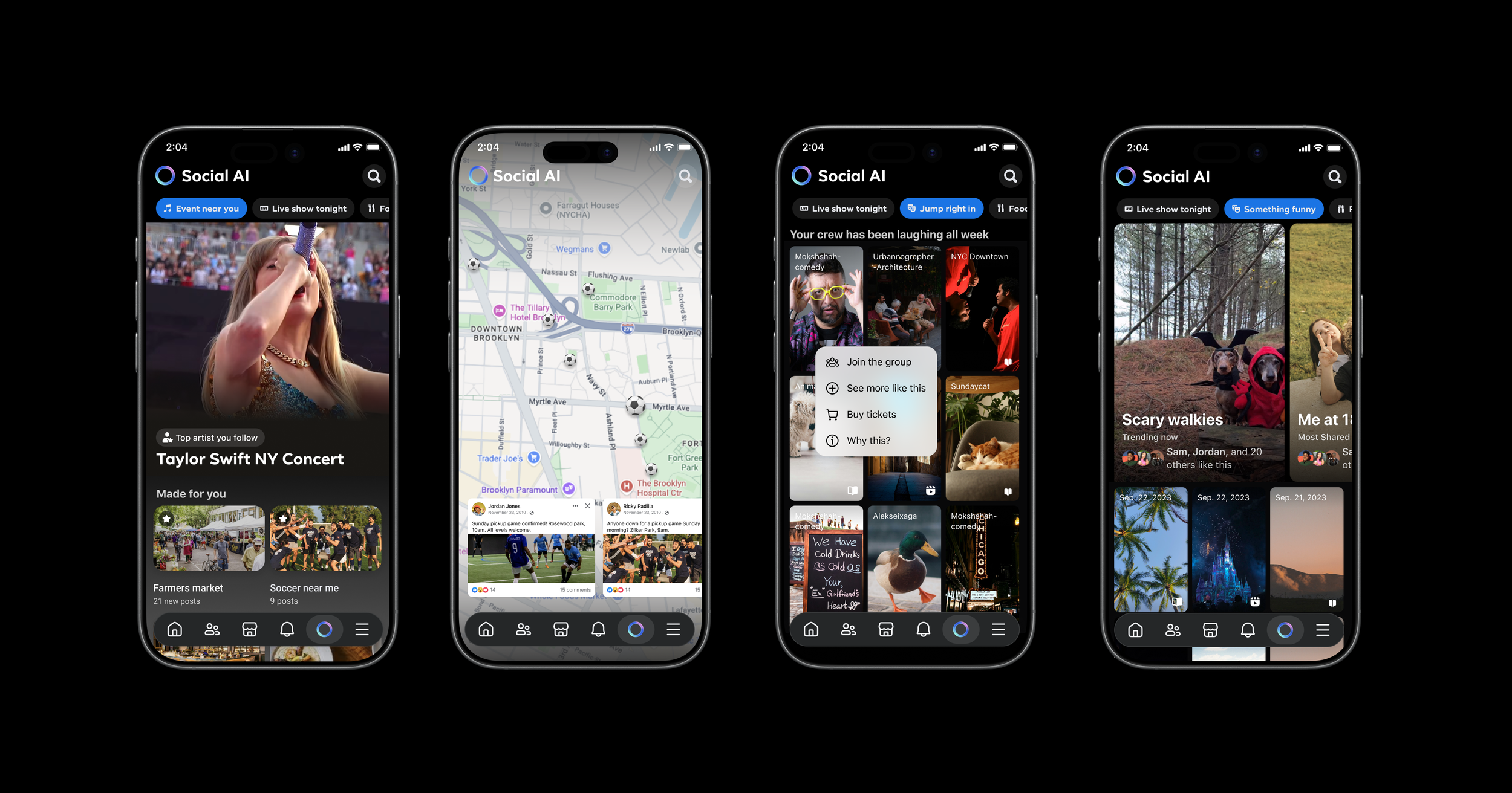
Social AI: Curator, not generator
Social AI started as a hackathon project. Our team asked a simple question: what if Facebook's social graph — 3B+ connected users, 15 years of social behavior, 1.8B people in Groups — could actually help people find what matters to them?
We designed Social AI not as a chat window, but as a curated feed — powered by your community. You say "something funny" and get a living feed of what your friends are actually laughing at. You say "I'm looking to play soccer" and your neighborhood's entire soccer world surfaces — groups, games, friends who play.
The signature element was the Socialite Card: an editorial voice that connects dots across your social graph. Not synthetic content — real context. "Priya, Marcus, and 6 others posted about this." Warm, witty, deeply social. The AI doesn't replace your community. It surfaces it.
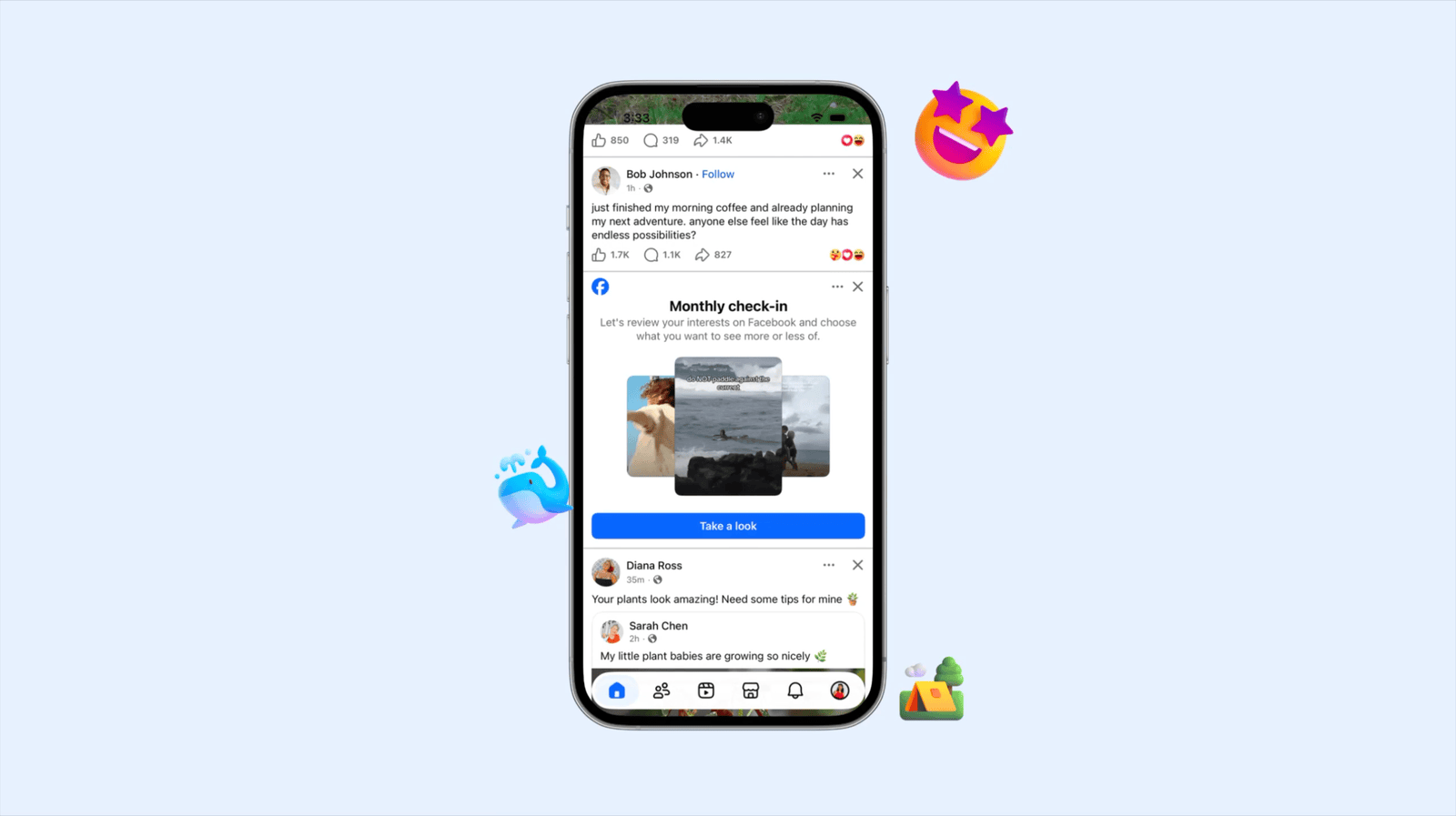
Monthly check-ins: Make a preference feel alive
One concept I'm excited about is Monthly Check-ins — a guided reflection experience that turns a static preferences panel into something engaging and game-like. Instead of burying personalization in settings, it surfaces periodically as an invitation: here's what your feed has been showing you, here's what you've been responding to, here's how you can shape what comes next.
The insight is that preferences change. What you care about in January isn't what you care about in June. But most personalization systems treat your signals as permanent. Monthly Check-ins make preferences feel malleable — something you revisit and refine, not something you set once and forget.
03 / Obsession
I don't let go until it's right. V1 through V4 in one half. The gesture timing on a dismiss button. The 16% "Other" problem. The details are where the impact lives.
Tell us why: Giving people a voice in their feed
Facebook's feed didn't feel personalized. Despite years of ML advances, users still didn't feel heard. So our team designed "Tell Us Why" (TUW) — a feedback system that gives people a real voice in how their feed works.
When you hide a post, a tombstone appears with multi-select pills asking why. Not a binary thumbs-down — a structured, specific signal. "Not relevant." "Too many." "Offensive." Each response feeds directly into the ranking models that shape what you see next.
We shipped V1 through V4 in a single half. Each version came from not being satisfied with the last:
V1 introduced multi-select pills — CTR jumped over 100% compared to the previous design. But it caused a 51% regression in Snooze and Report. Not good enough.
V2 fixed it — consolidated “Snooze” and “Report” into the same step so nothing got lost.
V3 tackled the "Other" problem. 16% of responses were selecting "Other" — that's unclear intent, unusable signal. We explored freeform input to capture what the pills missed.
PUF flipped the entire model. Why only ask about what people don't like? We designed a positive feedback flow — "why do you like this?" — to capture the full picture.
Each version was a response to something that bugged us. The results validated the thesis: when users feel heard, they engage more, which generates better signal, which leads to better content. A flywheel — powered by good design at the entry point.
Dislike on Reels: a simple way to say "Not this"
Reels carried nearly three-quarters of Feed's volume but had almost no lightweight way for users to say "I don't want this." The options were buried in menus most people never found.
We designed a feedback entrypoint for Reels — the kind of thing that sounds simple but isn't. A visible dislike on every Reel changes the consumption feel of a format built on flow. Getting it right meant obsessing over gesture, timing, and visual weight until it felt like a natural part of the swipe, not an interruption of it.
How do you give people a voice without getting in their way? That question kept us iterating long after the "obvious" solution was on the table.
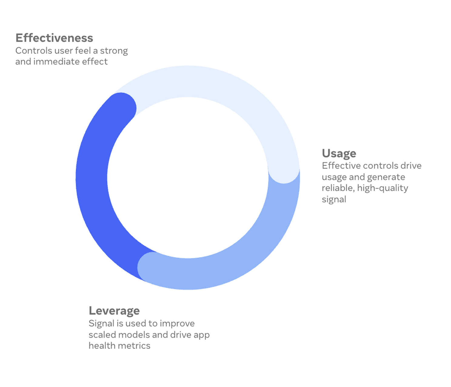
The Personalization flywheel
All of this obsession points somewhere: a flywheel where people's preferences are respected, their experience feels uniquely theirs, and their engagement generates better signal — which makes the experience even better.
It starts with effective controls that people can feel working. That drives usage, which creates reliable, high-quality signal. That signal improves the models. And better models make people trust the controls more — so they use them again.
The designer's role in this flywheel is to make every touchpoint feel human: the Interest Picker that welcomes you in, the TUW tombstone that listens when something's off, the Monthly Check-in that invites you to reflect, and the Dislike on Reels that lets you shape what you see with a single gesture.
Personalization isn't a feature. It's a relationship between people and the platform. And design is what makes that relationship feel real.
A note on AI in my process
AI didn't change what I design. It changed the pace. It's a tool — a very useful one — and here's where it actually helps me:
Brainstorming — I use AI to generate a wide range of ideas quickly. I still pick the ideas worth pursuing — but I get to the good ones faster because I've seen more bad ones.
User research — Our team generates a lot of research. AI helps me summarize findings, pull out key themes, and cross-reference insights across studies.
Data for product impact — I use AI to help me parse experiment results, size opportunities, and keep the numbers in my PRDs accurate.
Prototyping and dogfooding — I prototype in SwiftUI. Full navigable flows that used to take days now take hours. Real interactive prototypes the team can hold in their hands and dogfood.
Writing code with engineers — I use AI to help generate diffs and contribute directly to the production codebase, working alongside engineers who review the code. It lets me go beyond mocks and specs — I can participate in building the real product.
None of this replaces the core of the work: understanding people, making hard calls, and pushing for quality.
Honest Footnotes
On rapid iteration: V1 through V4 in one half sounds heroic. It was also exhausting. Speed is a superpower until it becomes a treadmill. The hardest design decision I made was knowing when a version was good enough to test, even when I could see ten things to improve.
On designing for people you'll never meet: The hardest part of design at this scale is resisting the urge to design for yourself. Every feedback flow, every control, every picker is used by people whose lives and contexts I'll never fully understand. Positive social impact at scale means designing with humility about who you're designing for.
On pitching ideas that might never ship: Social AI might live forever in a Google Slides deck. Monthly Check-ins might stay a concept. That's OK. The value of an ambitious proposal isn't always the launch — it's the conversation it starts, the assumptions it challenges, and the way it shifts what the team thinks is possible.
On tools and judgment: The tools I use: Figma, SwiftUI, AI, data, they all make me faster. But the judgment, what to build, what to kill, what to fight for — that's still mine. Speed without taste is just noise.