
Microsoft · Product Vision · 2020Microsoft WXC Design Vision 20/21
The context
In May 2020, the world locked down, and Microsoft reorganized. The WXC Design Direction team was born into both disruptions at once. A new team, a reshuffled org, and a global pandemic that had everyone rethinking how people relate to their devices.
We saw an opening. With routines upended and screen time surging, consumer expectations were shifting faster than product roadmaps could keep up. Our mandate: find moments of delight inside existing Microsoft products, and incubate new ideas that push a more consumer-grade, emotionally resonant approach to experiences people use every day.
How we worked
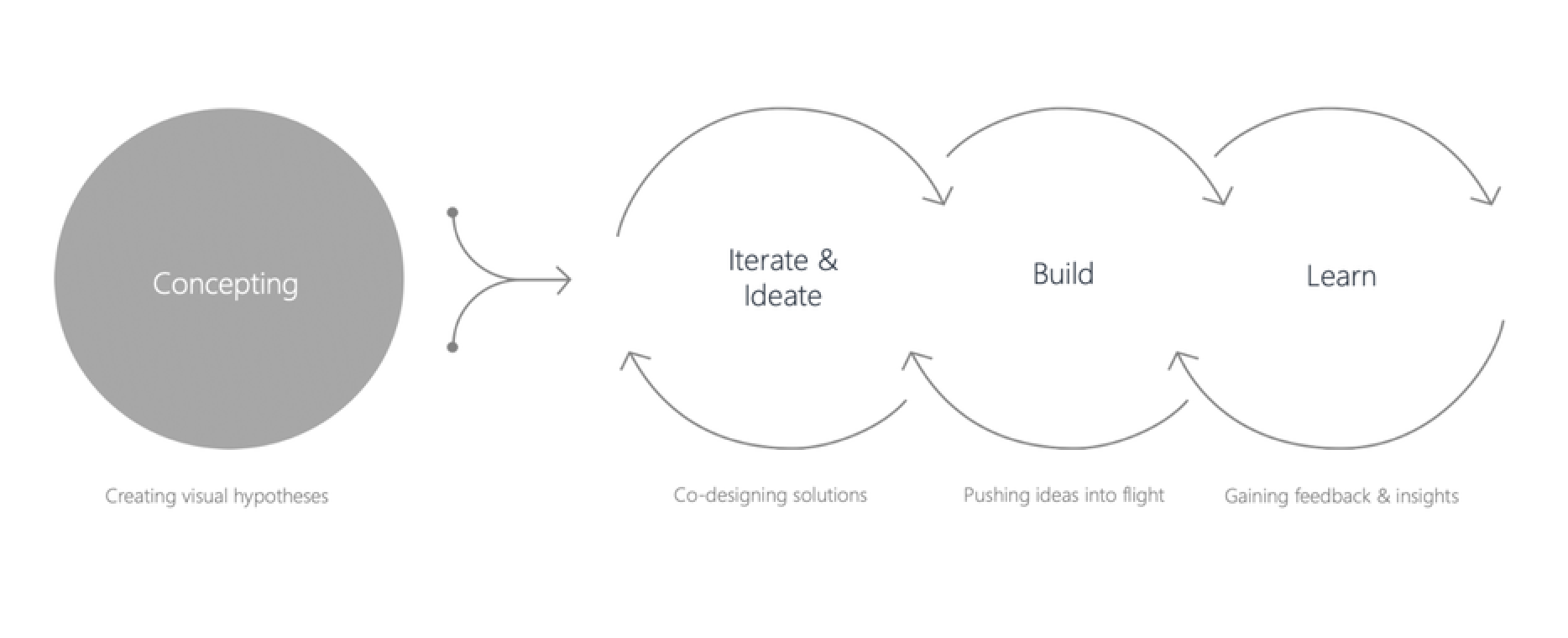
We ran in two laps. Lap 1 was pure creative velocity — weekly explorations in partnership with product leads, concepting ways to amplify current experiences. No roadmap constraints, just questions worth answering. Lap 2 took the strongest hypotheses into product development: iterating with eng, building prototypes, running test flights, and proving the Design Direction could scale beyond a moodboard.
The rhythm was concept → iterate & ideate → build → learn — then loop.
Subject areas
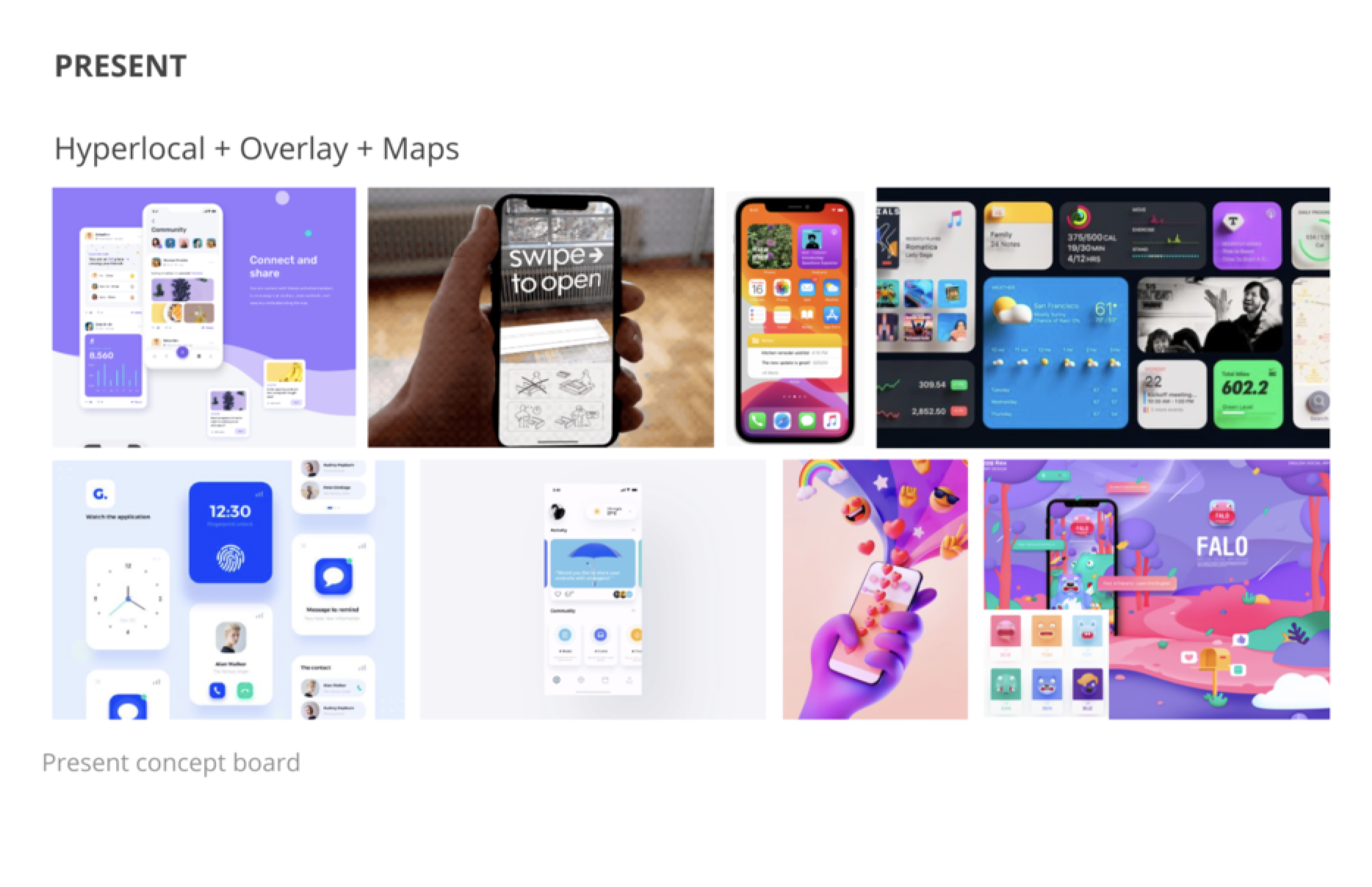
Over the course of the program, we explored 9+ concept territories — each a 2-day to 2-week sprint targeting a different surface of the Microsoft consumer ecosystem: Weather, Super App, Give Back, Maps, Taskbar Content, Shopping, Visual Discovery, Finances, Algo, and more in the pipeline. Below are the concepts I led.
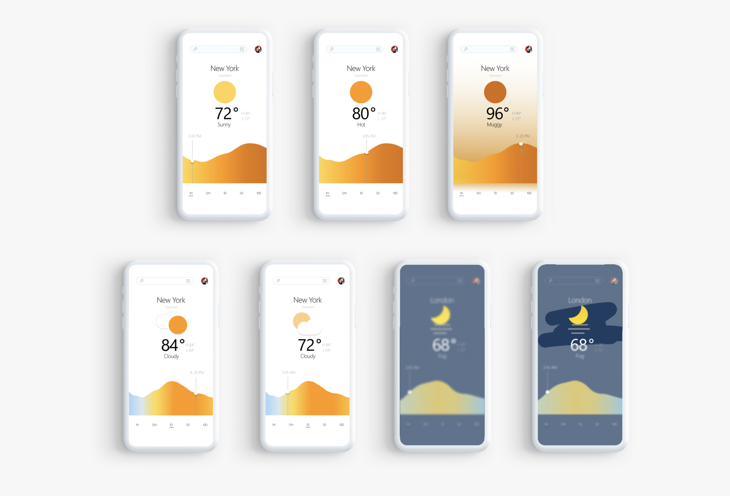
01 / Weather X
The brief: Weather apps had become commoditized. Every OS ships one. People check the forecast, glance at a number, and close the app. But what they actually need isn't a temperature — it's preparation. Should I bring a jacket? Will the commute be awful? Is this a beach day or a stay-in day?
We asked: What if weather felt less like a data readout and more like a trusted advisor?
In just 2 days, we explored three expressive directions:
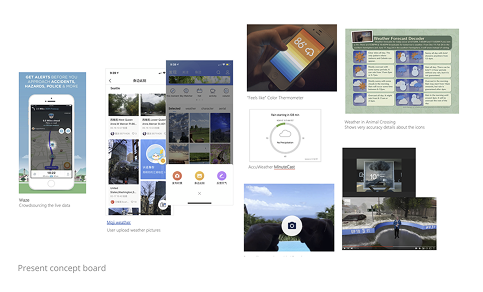
Present — clean, utilitarian, information-dense. The baseline.
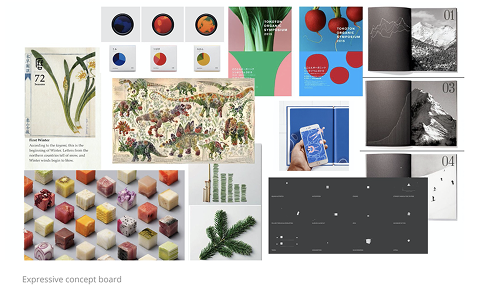
Expressive — bold color, editorial photography, weather as atmosphere and mood.
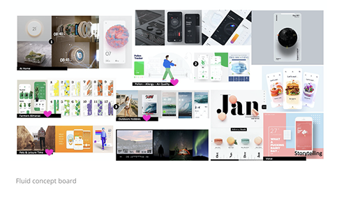
Fluid — gentle transitions, time-of-day responsiveness, weather as an ambient companion.
Key questions we pushed on: Is there a way to provide certainty about weather, not just data? Can we turn raw information into actual knowledge — like "you'll need an umbrella at 3pm" instead of "60% chance of rain"?
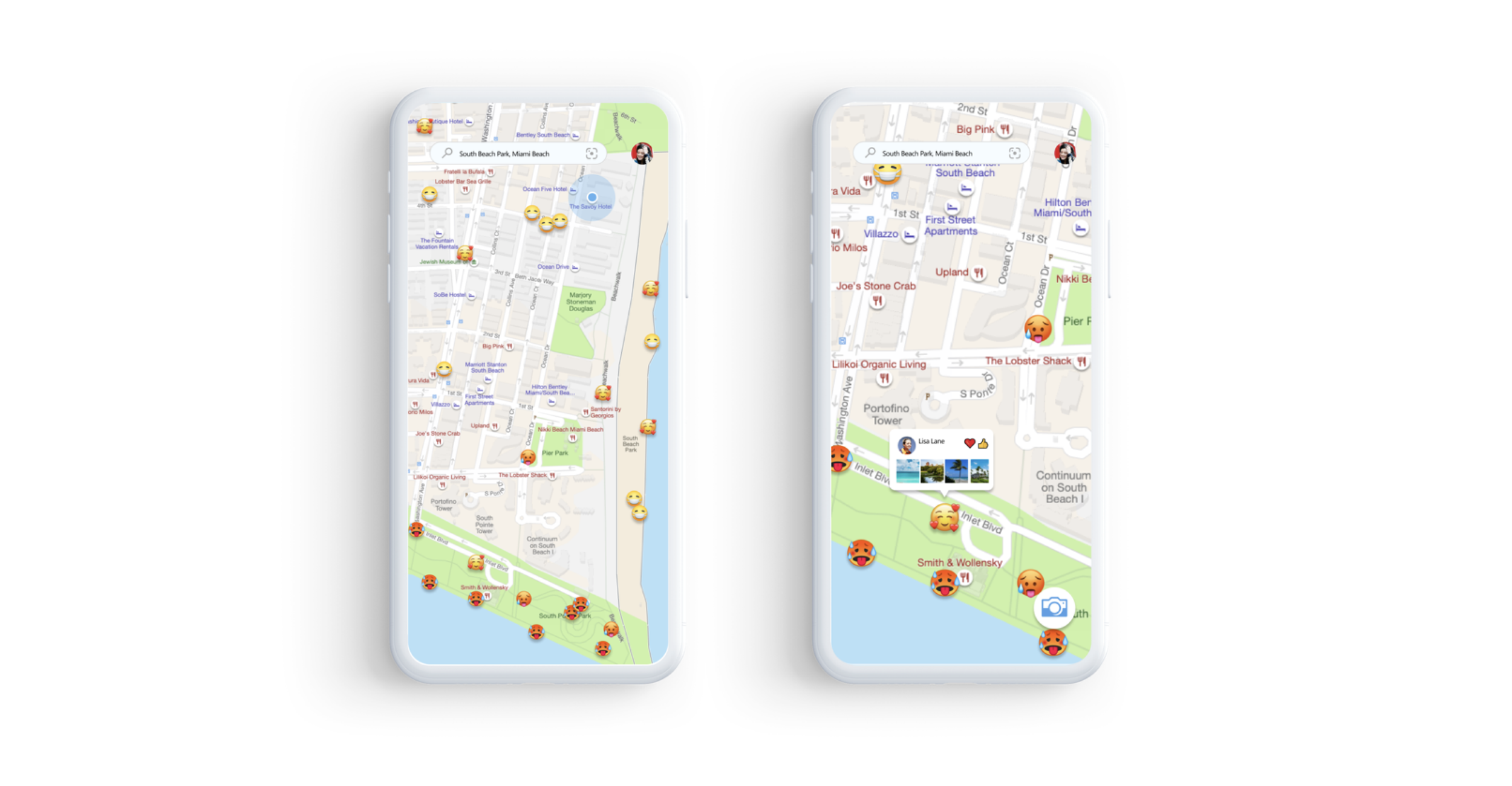
Proposal 01 / Crowdsourcing Folk Map
A community-sourced weather layer. Real people tagging real-time conditions on a map, so you're not relying solely on satellite data. Hyperlocal, social, alive.
Proposal 01 / Crowdsourcing Social Media
Weather context pulled from what people are already posting. Surfacing the human signal behind the data.
Proposal 03 / This minute “Feels like”
We are present by being specific and focused. Using specific color and motion helps the user engage with the weather, not just a number.
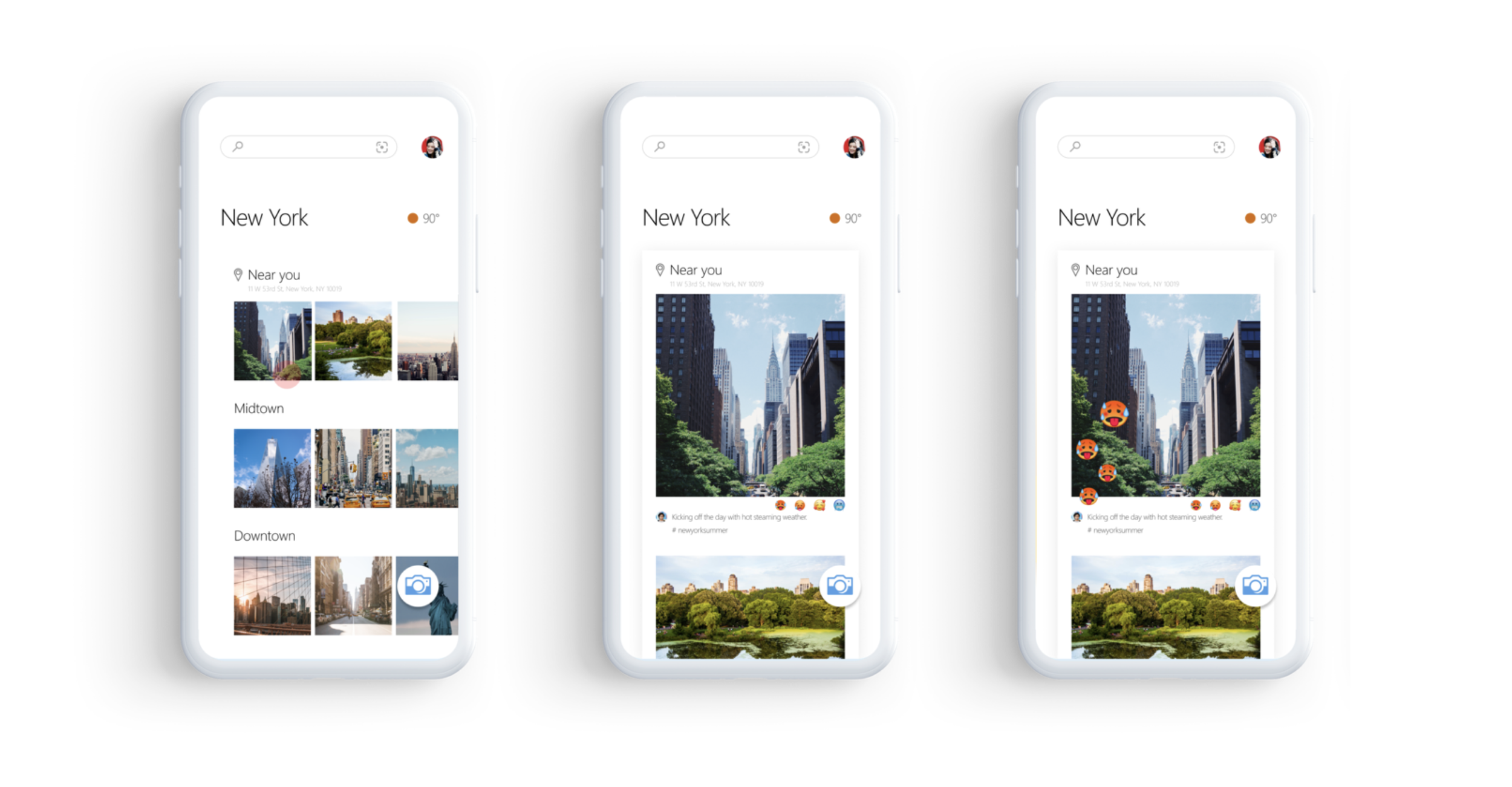
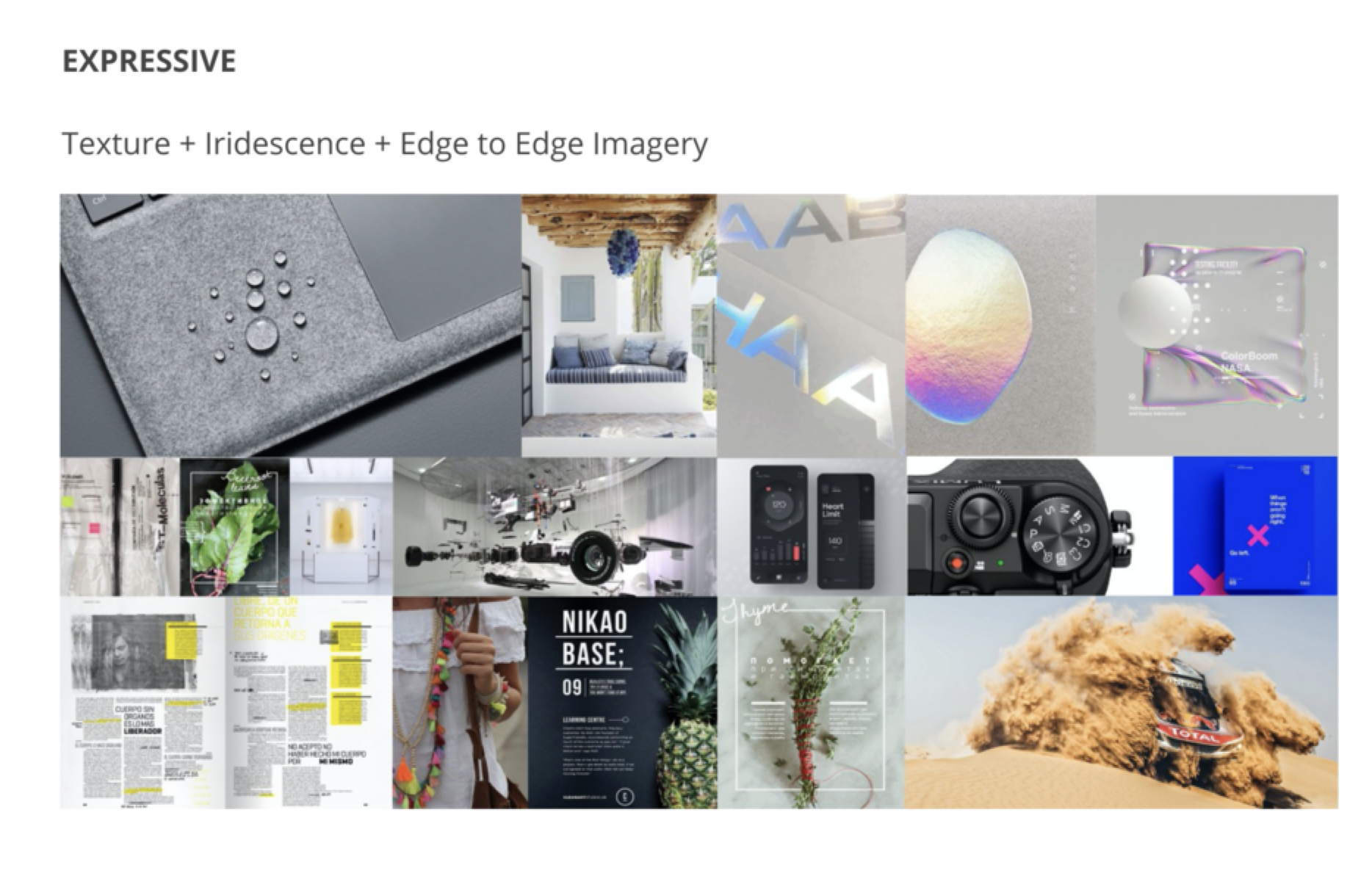
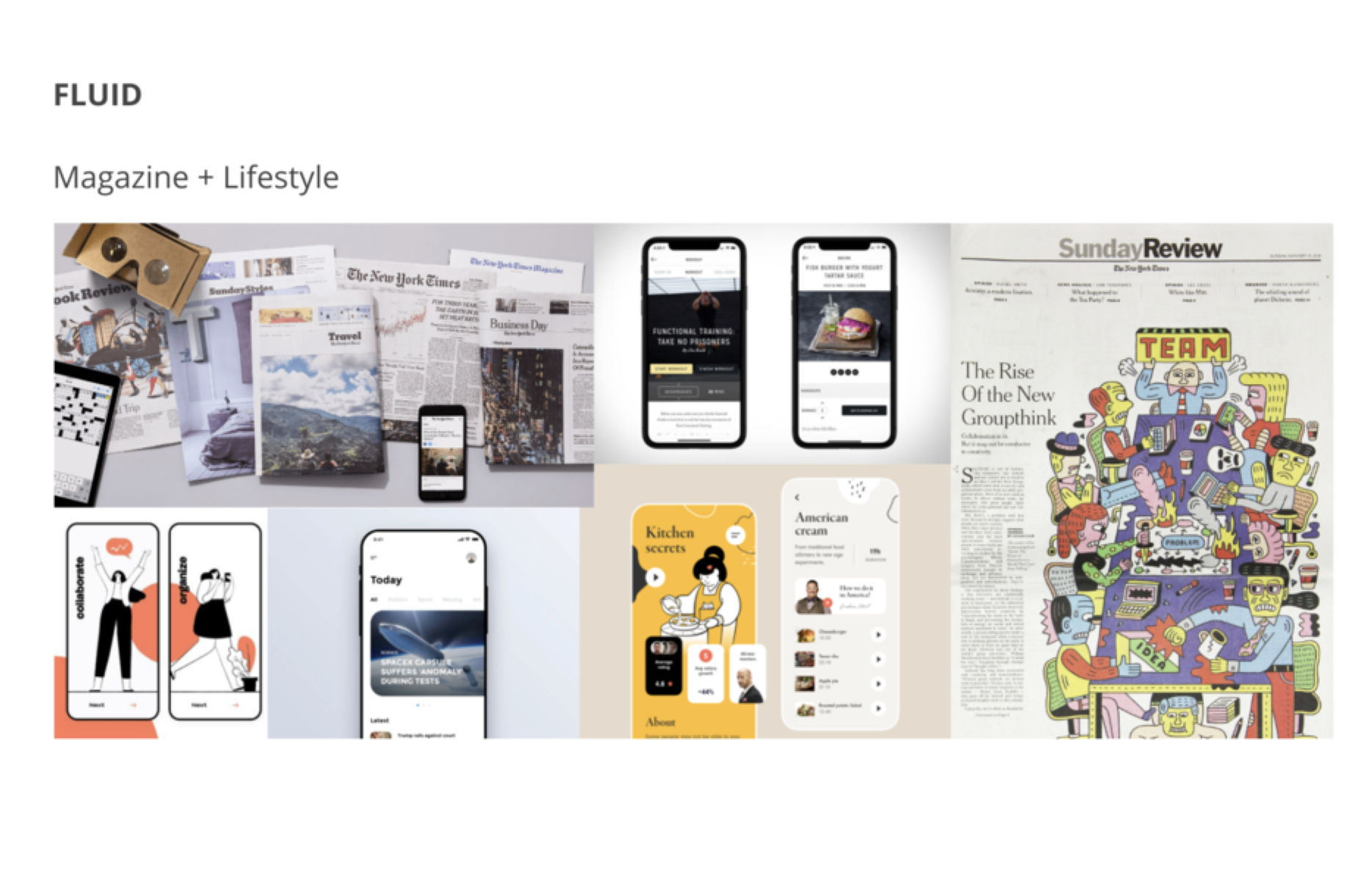
02 / Super App X
The brief: In May 2020, 5,778 apps were being added to the Play Store every single day. 35,000 hit the Apple App Store that month alone. When we set out to explore a Microsoft Super App concept, the question wasn't "can we build one?" — it was: "What strengths does Microsoft have that would make ours worth opening?"
Over 2 weeks, we explored four directions:
Present — Hypertexture, overlapping layers, and integrated maps. Dense but navigable.
Expressive — Iridescent textures, edge-to-edge imagery. Sensory, magazine-like.
Fluid — Editorial layouts, lifestyle content. The app as a personal magazine.
Curated + ML — Machine learning-driven content that gets smarter over time, but stays easy to scan.
Present / Integrated Homepage
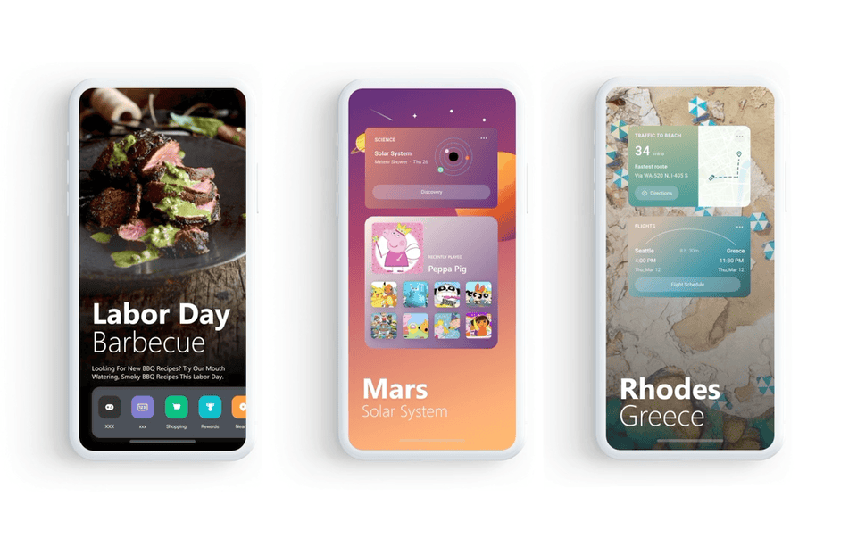
A rich, dynamic landing screen that blends media, tasks, and content into a fluid UI. Not a grid of app icons — a living surface.
Travel / Destination cards with immersive imagery, trip context, and booking all in one view.
News + Shopping — Breaking stories and product discovery side by side, without feeling like a cluttered feed.
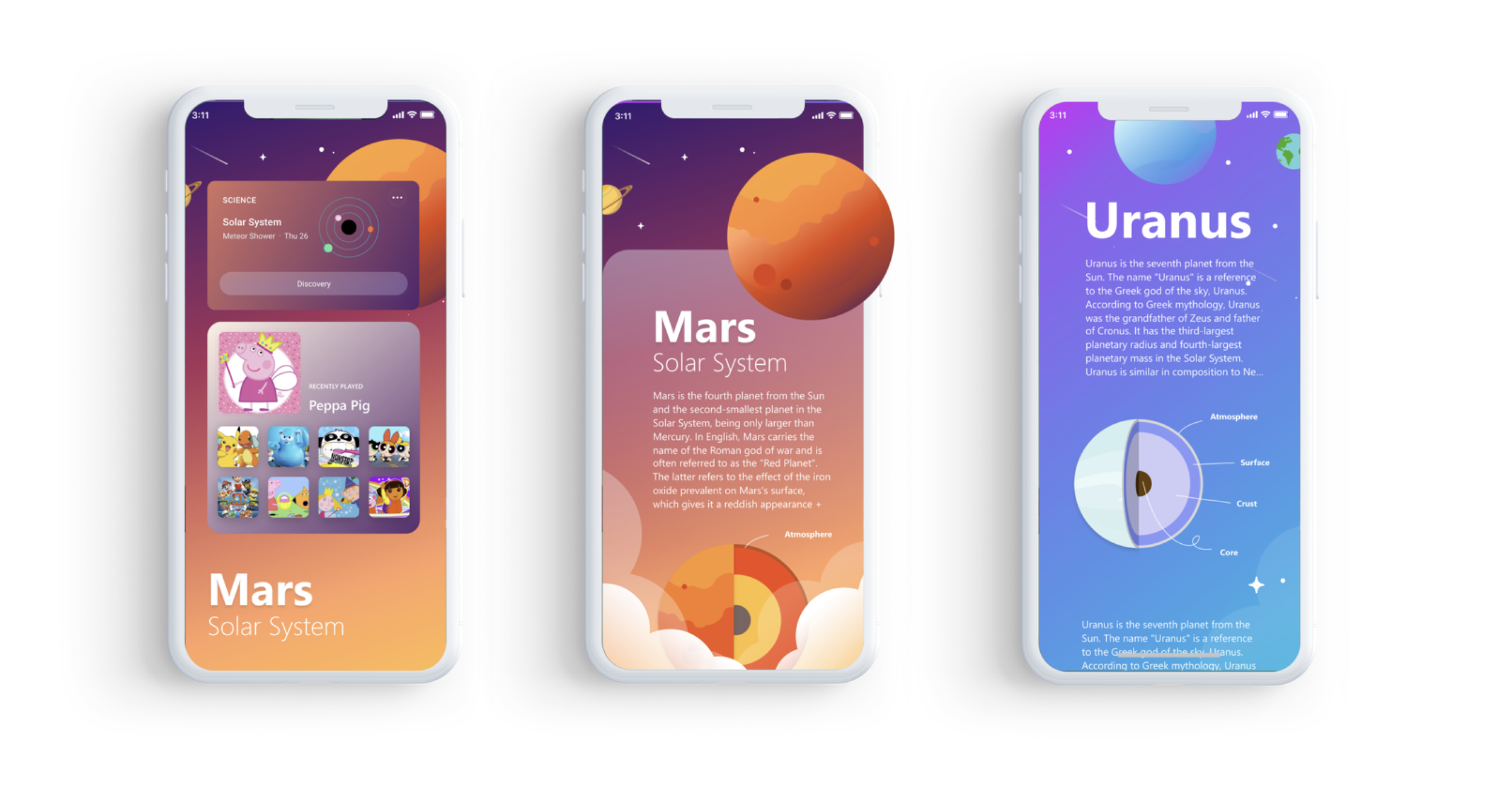
Mini Worlds (Kids mode) — Themed content capsules (Mars exploration, planetary science) with deep-dive storytelling inside bite-sized cards.
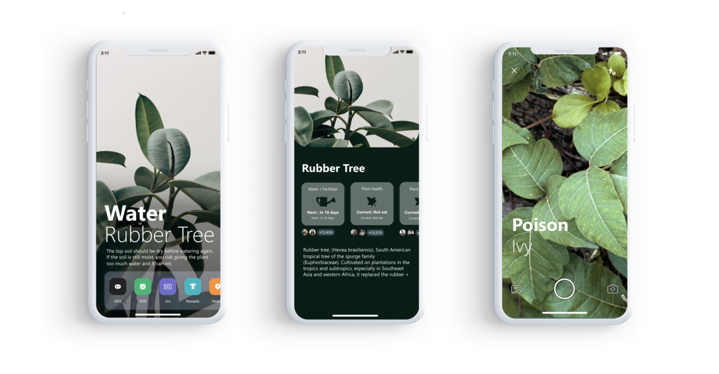
Lifestyle Controller — Botanical care, daily routines, personal interests, the app knows what you care about and surfaces it without you asking.
03 / Gives Back X
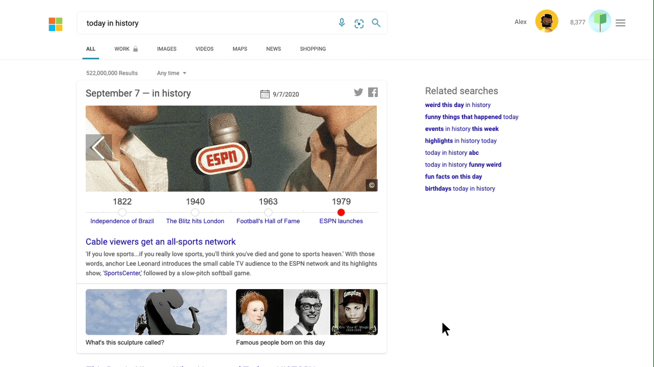
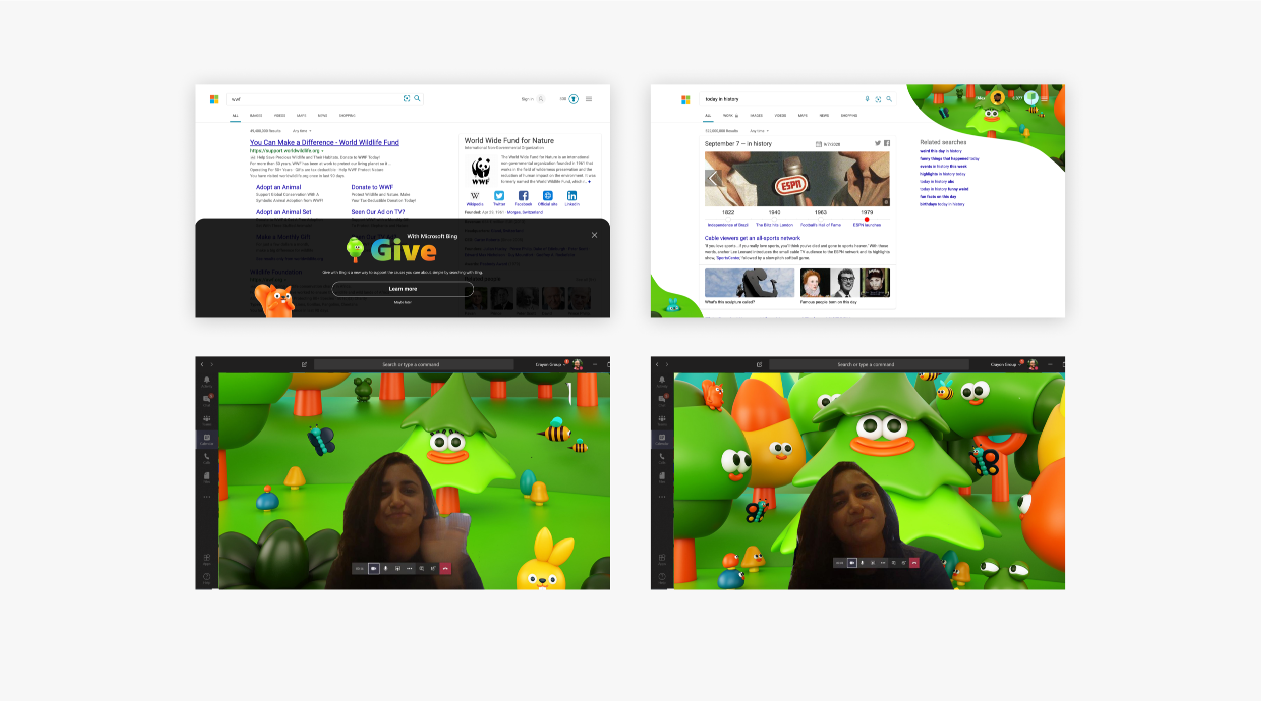
The brief: Bing Rewards was already a differentiator — users earn points just by searching. But most people didn't feel it. The product truth (Bing gives back rewards, time, and control) wasn't landing emotionally. We wanted to find new moments where that generosity becomes visible and motivating.
Design goals:
Make the act of "giving back" tangible every time someone uses Bing
Discover new reward moments that reinforce the product truth beyond the points dashboard
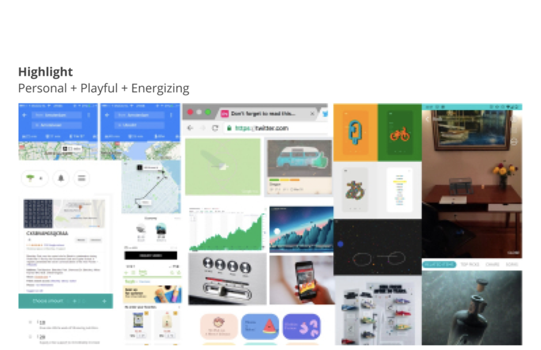
Over 2 weeks, we explored five expressive territories:
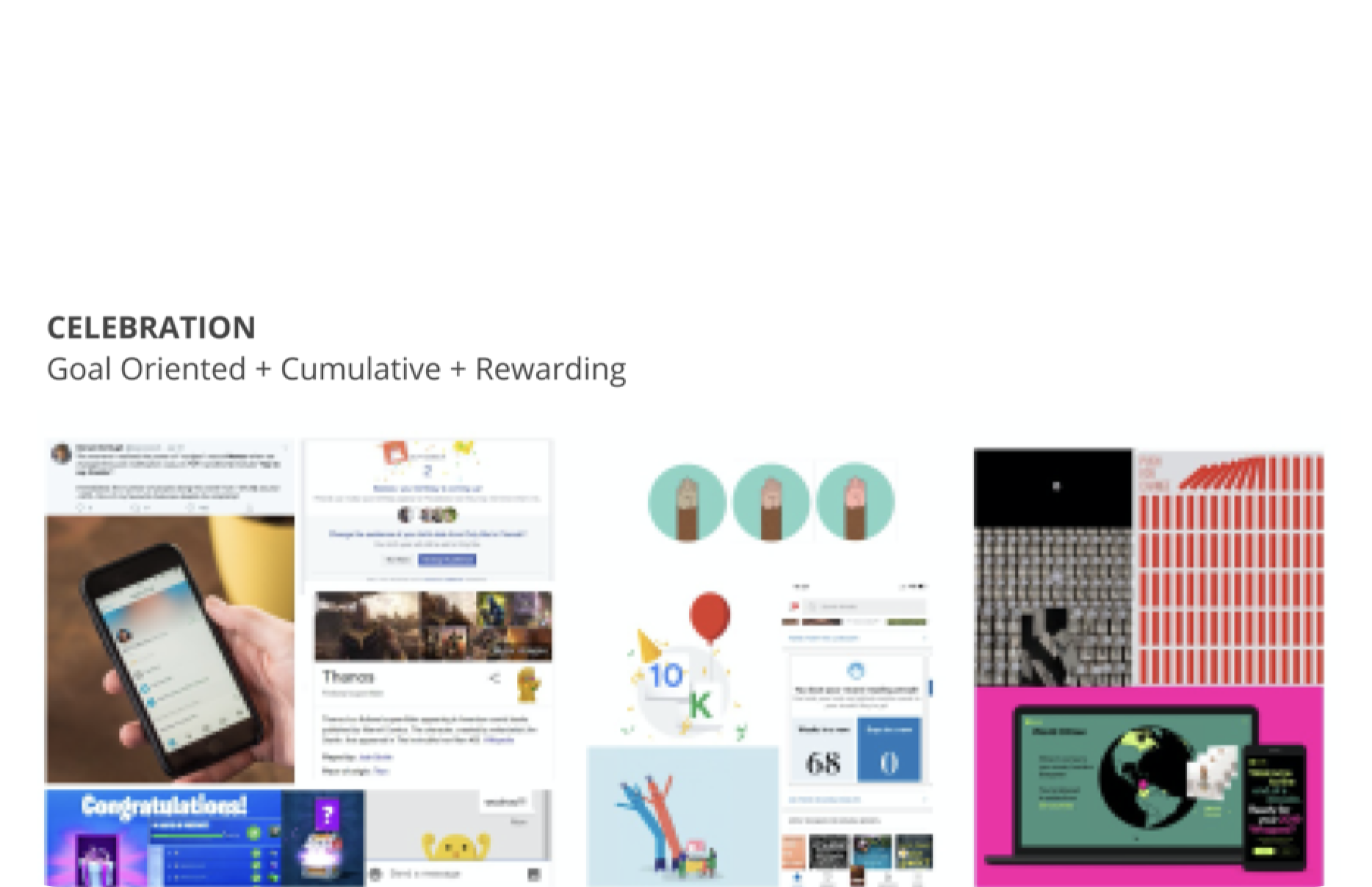
Celebration — Goal-oriented, cumulative, rewarding. Every milestone feels earned.
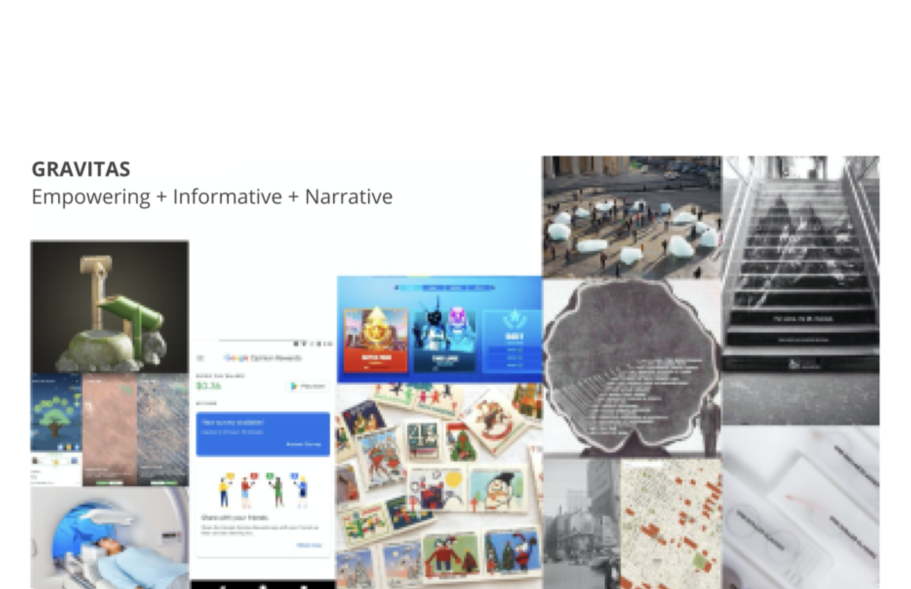
Gravitas — Empowering, informative, narrative. Rewards as a story of impact.
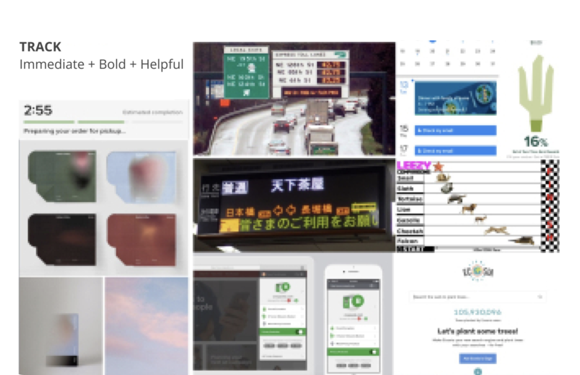
Track — Immediate, bold, helpful. Real-time feedback on every action.
Eyes — Data-forward, glanceable. Your giving at a glance.
Highlights — Relaxed, playful, energizing. Rewards that feel fun, not transactional.
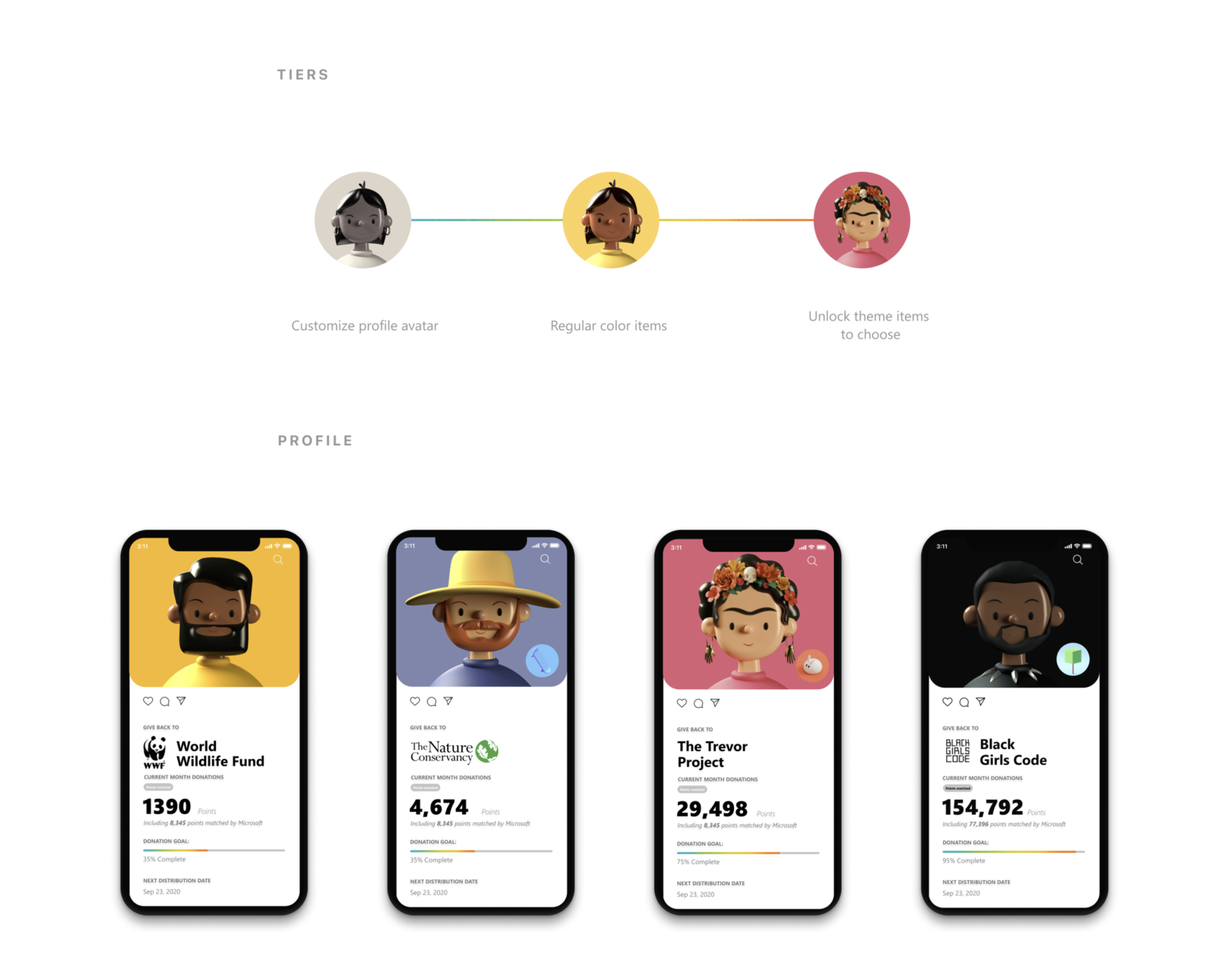
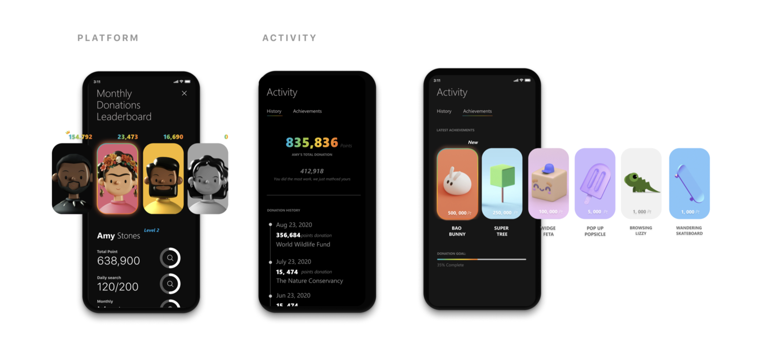
Highlight / Gamification for Microsoft Give
The standout concept turned charitable giving into a social game:
Tiers — A progression system from customizable profile avatars → regular collectible items → unlockable themed items. Your generosity has a visible identity.
Profile — Each user's profile displays their chosen charity (WWF, Nature Conservancy, Trevor Project, Black Girls Code) alongside a lifetime impact counter — turning donations into a badge of identity, not just a transaction.
Platform + Activity — Donation leaderboards, monthly giving challenges, and activity feeds that let you see how your community is contributing.
Tree Counter — A real-time environmental impact tracker. Every search plants progress. You watch your forest grow.
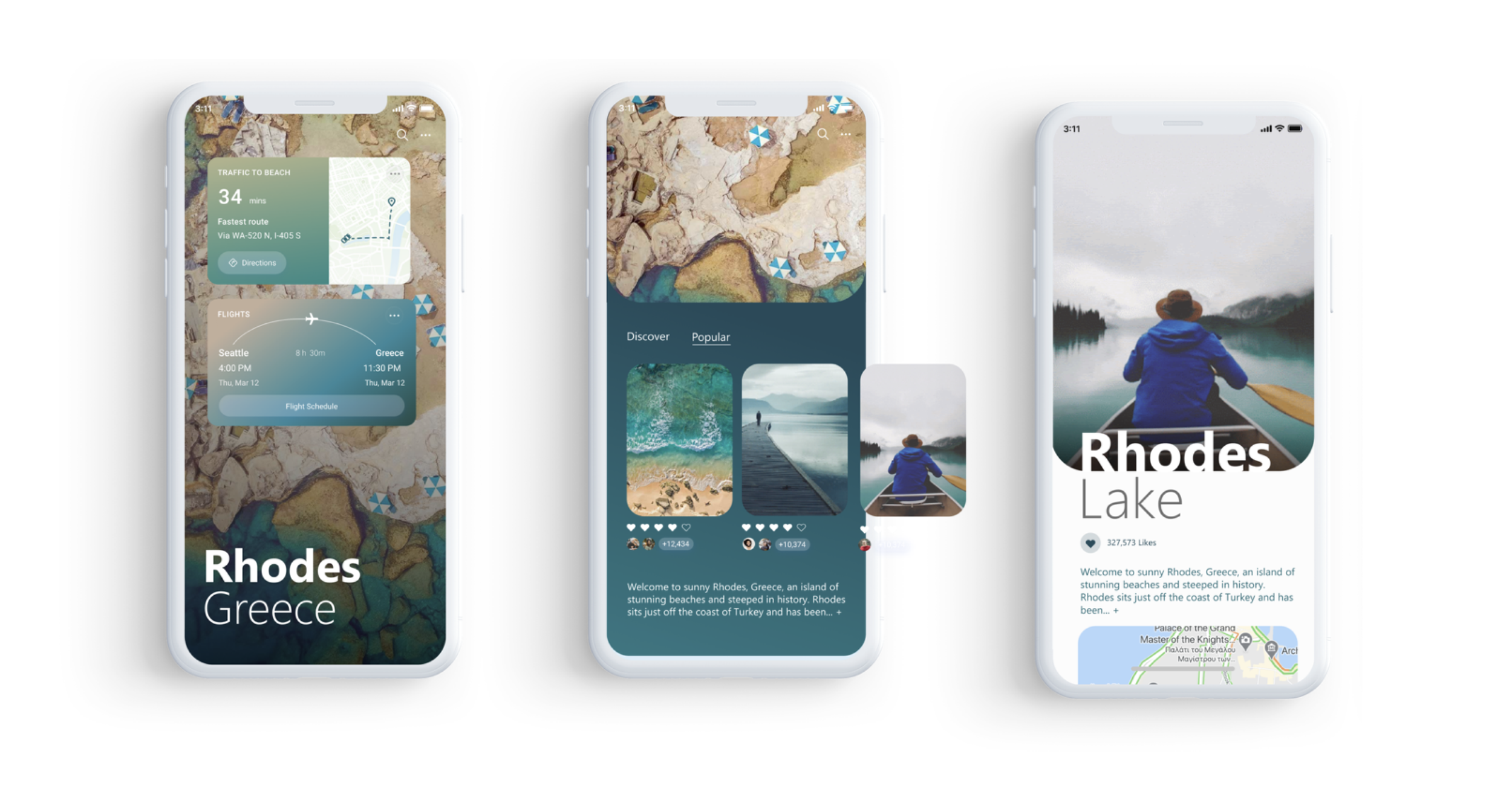
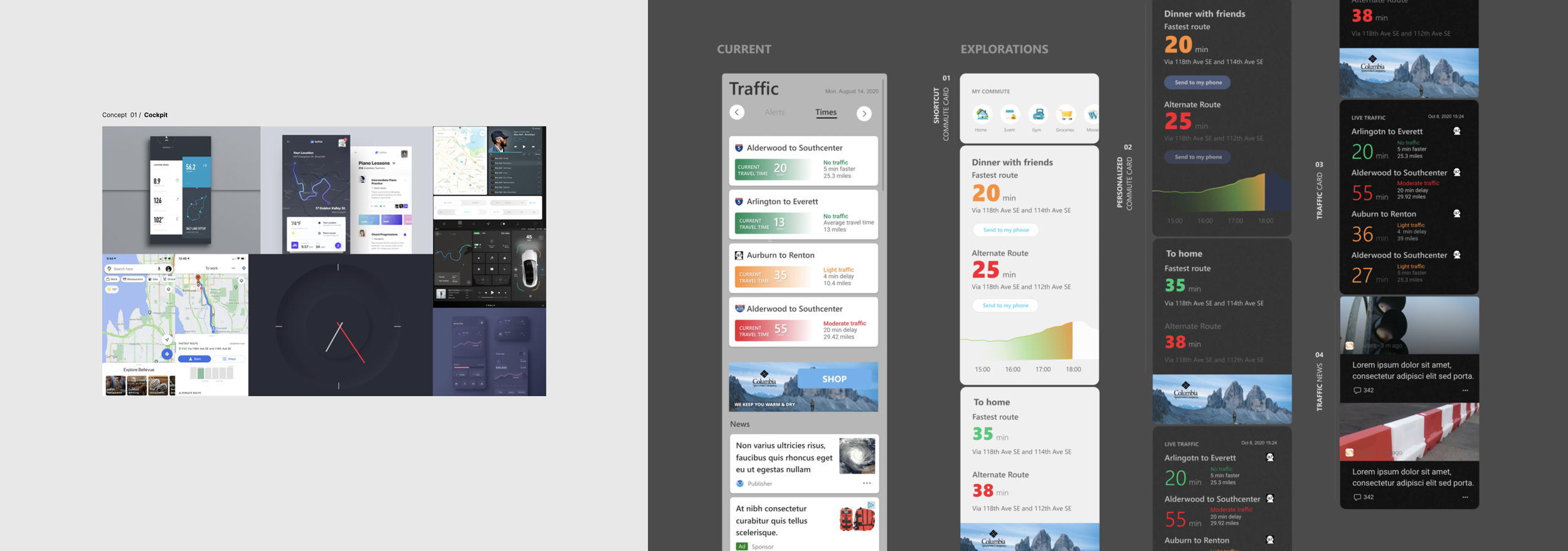
04 / Traffic Map X
The brief: For most people, a map is a tool that gets you from A to B. But maps are capable of so much more. They simplify complex information. They teach spatial thinking. They've literally saved lives in flash floods.
Maps are also containers for memory and story — they show us how the world was once understood, connect us to places we've been, and point us toward where we want to go. Every story takes place on a map. Sometimes we see it, sometimes we don't. But without maps, the story of our lives would unfold without a stage.
We spent 2 weeks asking: What if Microsoft Maps felt less like a GPS and more like a cockpit for understanding the world around you?
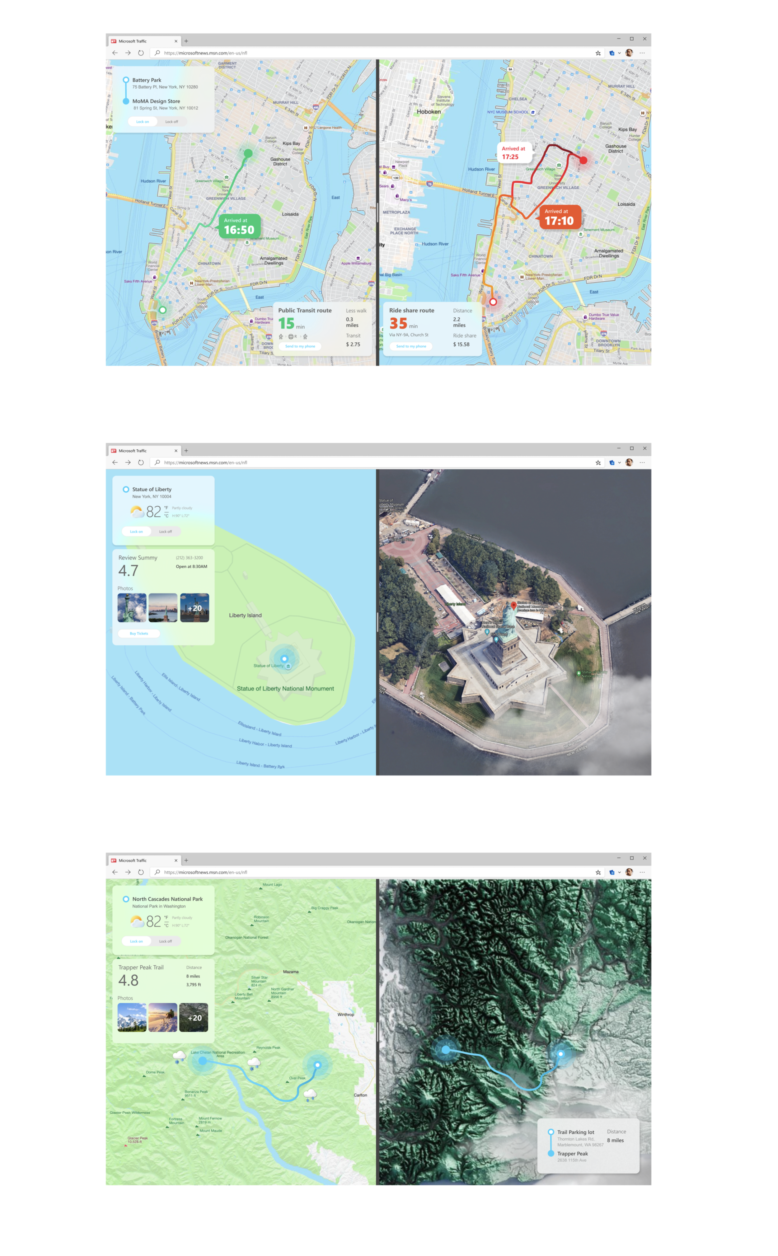
Concept 02 / Split Screens
Side-by-side map views that pair route planning with immersive location previews — satellite imagery, 3D terrain rendering, and rich point-of-interest cards. The left panel navigates; the right panel explores. Designed for the moment when you're not just going somewhere, but deciding whether to go.
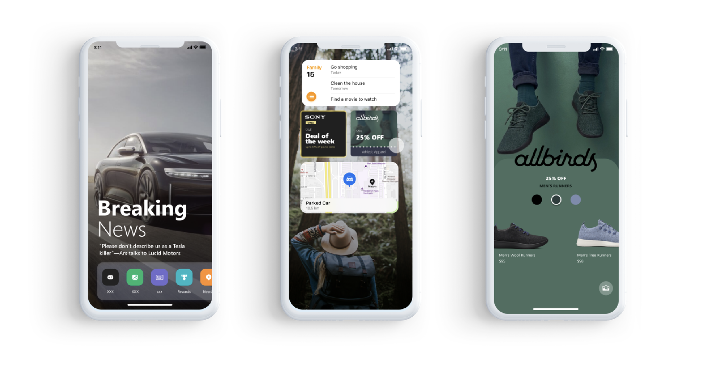
05 — Prong 0 X
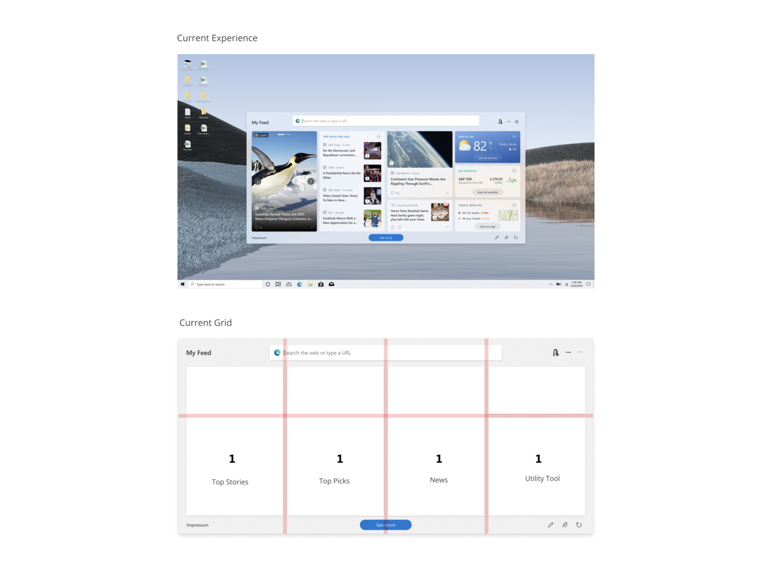
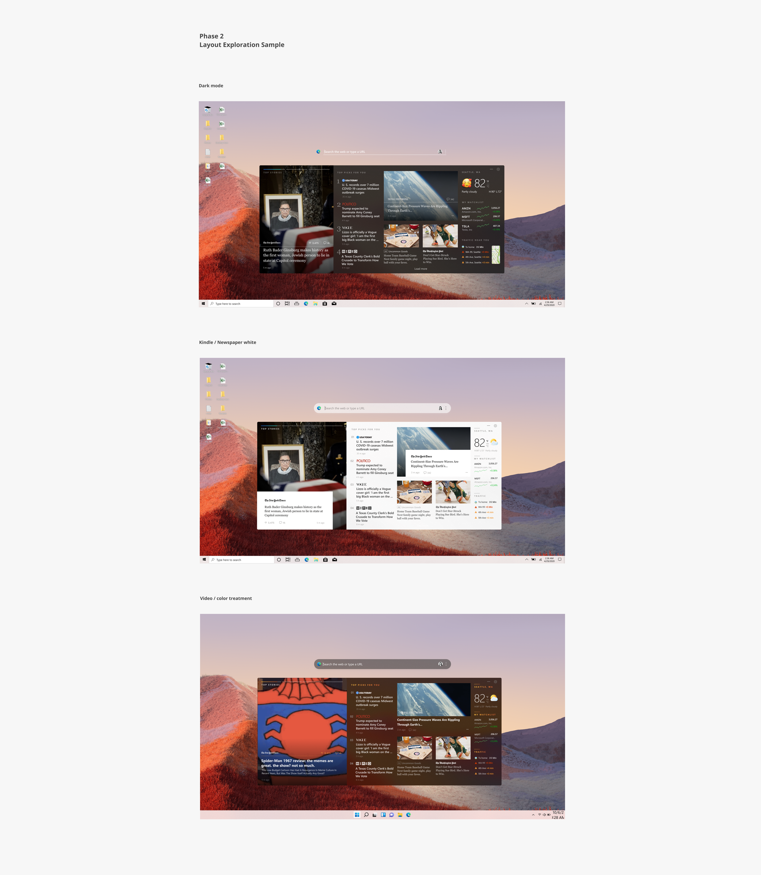
The brief: Windows 11 introduced a content feed on the Taskbar — news, weather, stocks — but the layout was rigid. One size, regardless of whether you're on a 13" laptop or a 32" monitor. We had 5 days to explore how a responsive, editorially-driven content experience could work at the OS level.
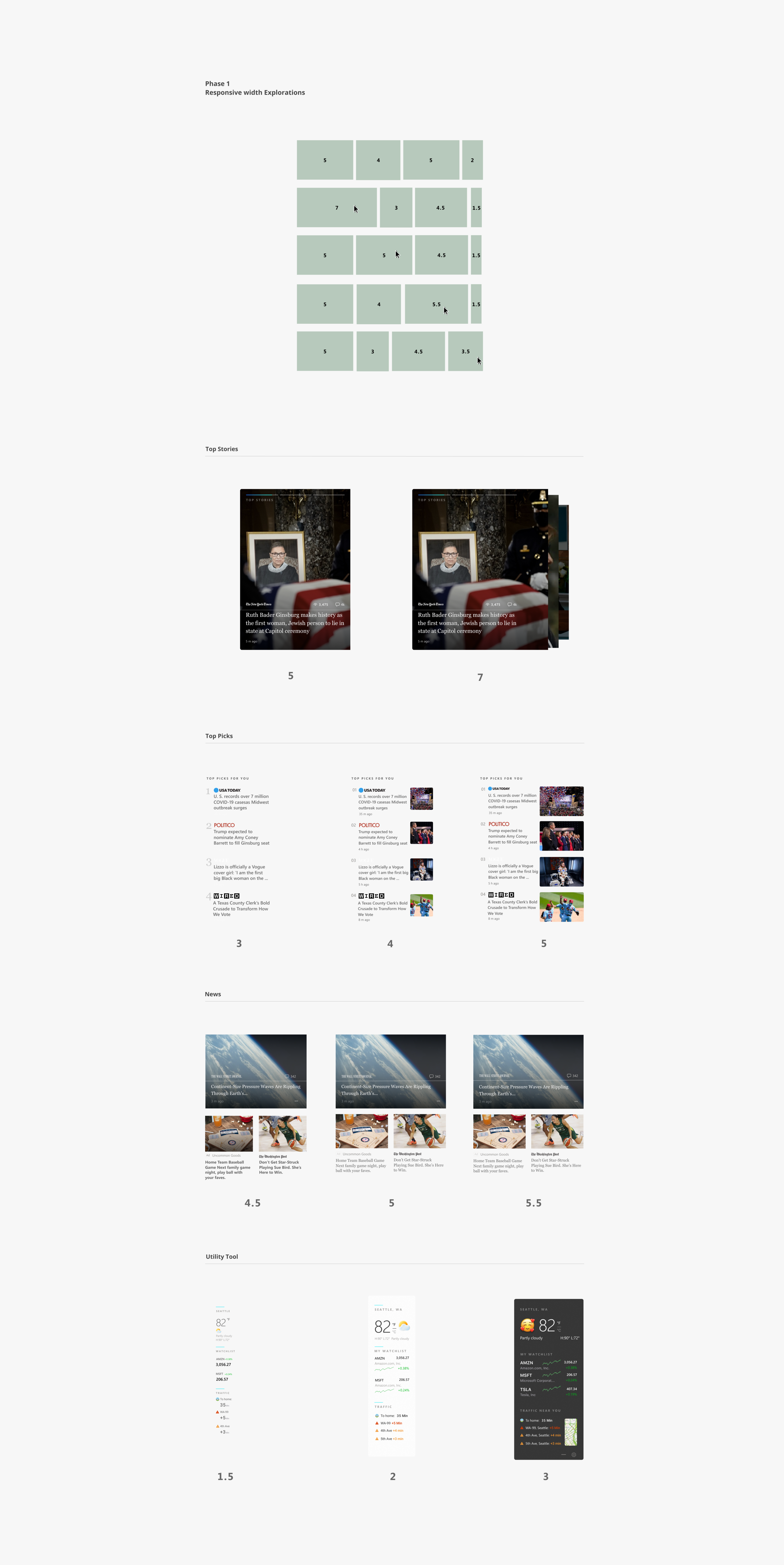
Phase 1 / Responsive Width Explorations
We broke the feed into its atomic units — Top Stories, Top Picks, News, Utility Tools — and tested how each content type scales across column counts. The question was granular: at what width does a news card lose readability? When does a weather widget deserve more real estate? Every content type has its own breakpoint personality.
What this work became
The Design Direction program proved that a small, autonomous design team — working in compressed sprints with creative freedom — could generate concepts that shifted how product teams thought about their own surfaces. Several explorations influenced shipped features across Bing, Windows, and Microsoft 365. The program itself became a model for how Microsoft approaches early-stage consumer design exploration: fast, expressive, and grounded in real product surfaces.