Microsoft · 2018Bing User Engagement: Designing a System That Teaches
You search for a recipe on Bing. The results are good — but you never notice the rich recipe card that could save you a click, the visual search feature that could identify ingredients from a photo, or the rewards points you're earning with every query. You leave and come back tomorrow, and nothing about the experience remembers you were here.
Bing had a feature problem — but not the one you'd expect. The features existed. Many of them were genuinely useful: visual search, intelligent answers, shopping comparisons, rewards, personalized notifications. The problem was that users didn't know they were there. And the ones who did often couldn't figure out how to use them.
The team's instinct was to announce features through email blasts and hope users would find the rest on their own. But a search engine isn't an app you open with intent to explore — it's a utility you pass through. If you don't teach users about features in the context of using them, at the right moment in their journey, the features might as well not exist.
My role
I partnered with Product, Growth, Rewards, and Engineering teams to create a unified approach to user communication — replacing ad-hoc feature announcements with a principled system grounded in behavioral science and user lifecycle data. The work spanned desktop web, mobile web, browser extensions, email, and in-SERP messaging.
As Design Lead, I owned the end-to-end design of Bing's User Engagement system and User Messaging Platform — the frameworks that governed how Bing communicates with users across every touchpoint and lifecycle stage. I led the strategic framework, interaction design, visual system, and component library.
The insight: users aren't one audience — they're a lifecycle
The existing approach treated all users the same: blast a feature announcement and hope it sticks. But a potential user who has never tried Bing needs something fundamentally different from a fan user who searches 100+ times a month.
The breakthrough was mapping user engagement to a lifecycle model. We segmented users into six stages based on monthly Direct Search Query volume — Potential, New, Infrequent, Swing, Frequent, and Fan — and designed distinct communication strategies for each transition:
Growth (Potential → New) — Attract users to try Bing through cross-platform upsells and extensions
Onboarding (New → Swing) — Help new users discover Bing's unique capabilities at the right moment
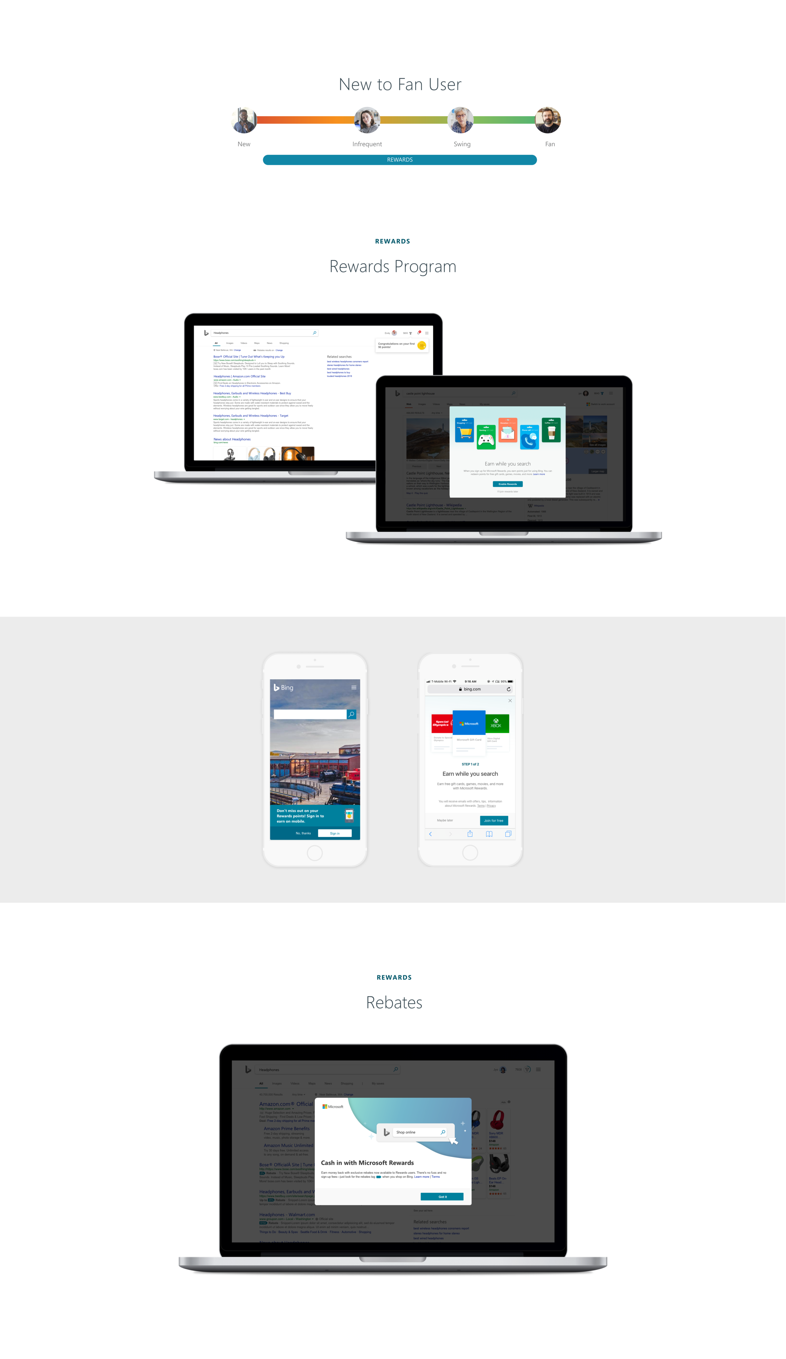
Rewards (New → Fan) — Retain users through the Rewards program and rebates
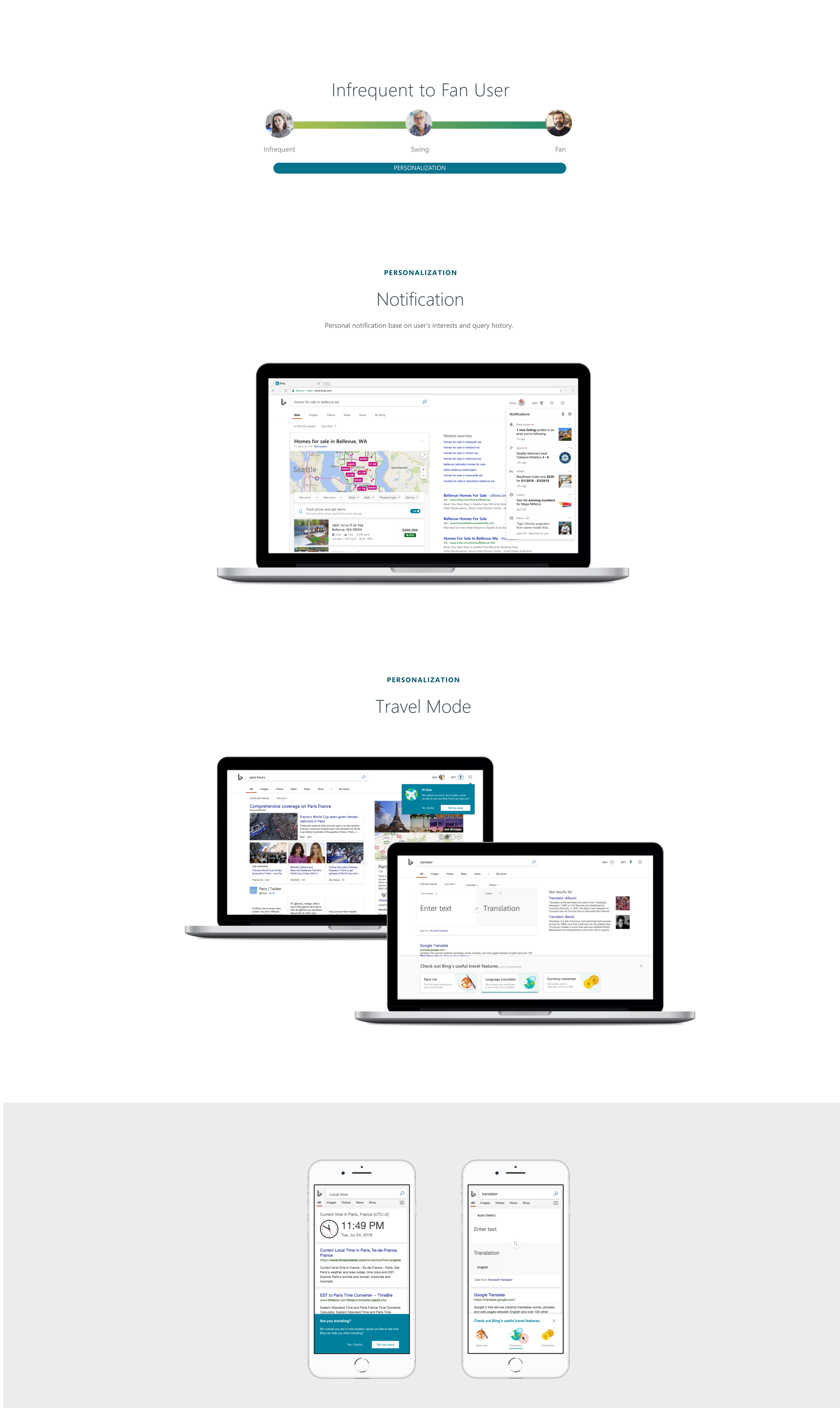
Personalization (Infrequent → Fan) — Invest users deeper through notifications, travel mode, and contextual features
Messaging Platform (All stages) — Re-engage lapsed users through targeted email and triggered messages
This wasn't a marketing funnel — it was a design system organized around user maturity. Each stage had its own goals, triggers, and appropriate level of intervention.
The framework: a messaging intrusiveness spectrum
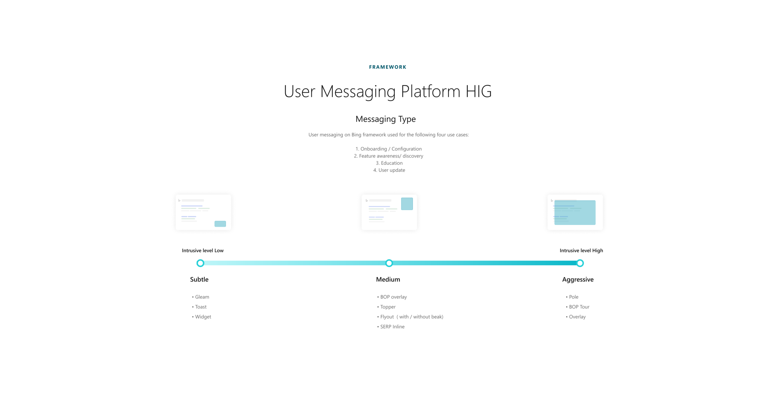
The lifecycle told us when to communicate. The messaging framework told us how. I designed a Human Interface Guideline (HIG) for Bing's User Messaging Platform that classified every message type along two axes:
By use case:
Onboarding / Configuration
Feature awareness / Discovery
Education
User update
By intrusiveness level:
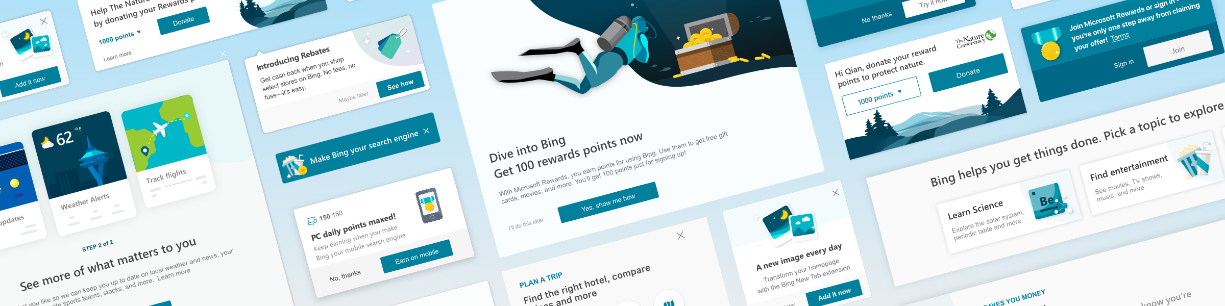
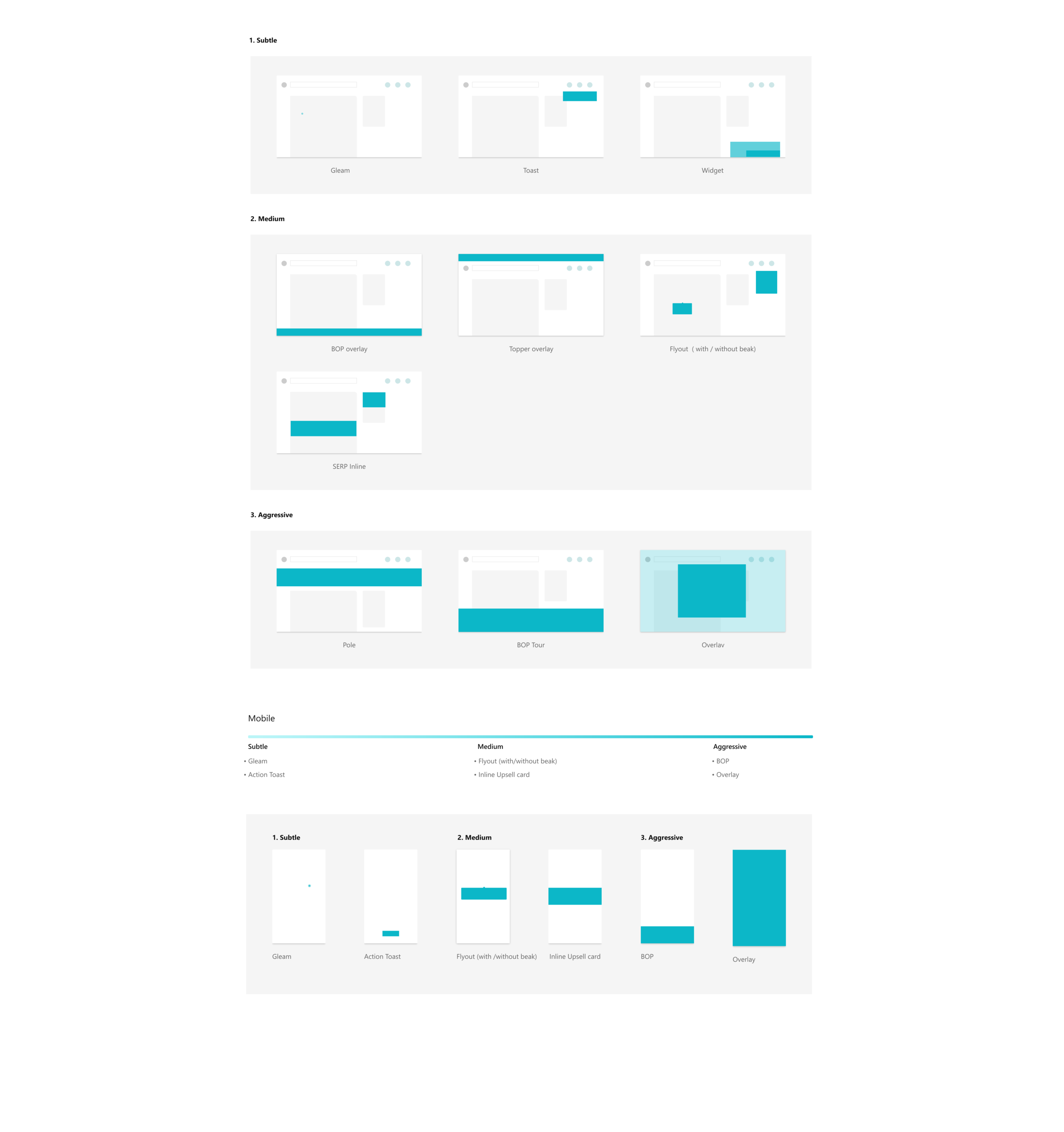
Subtle — Gleam, Toast, Widget: ambient signals that don't interrupt the search flow
Medium — BOP overlay, Topper, Flyout, SERP Inline: contextual prompts that appear alongside results
Aggressive — Pole, BOP Tour, Overlay: full-attention captures reserved for high-value moments
The principle was simple: match the message's intrusiveness to the user's lifecycle stage and the value of what you're teaching. A subtle gleam for a returning user noticing a new feature. A full overlay for a first-time visitor who needs orientation. The framework prevented the most common sin in user engagement: treating every announcement like it deserves a full-screen takeover.
The system in action
Growth: attracting potential users
For users who hadn't tried Bing, we designed cross-platform entry points. MSN, Xbox Live Gold, and browser extension prompts introduced Bing's value proposition in contexts where users were already engaged with Microsoft products — meeting them where they already were, not asking them to come to us.
Onboarding: from first visit to habit
New users received a Welcome to Bing experience that highlighted three value propositions through interactive cards — rewards, personalization, and search capabilities. But the real onboarding happened contextually: when a user searched for a recipe, we introduced the recipe card. When they searched for a location, we surfaced map features. The search query itself became the trigger for feature education.
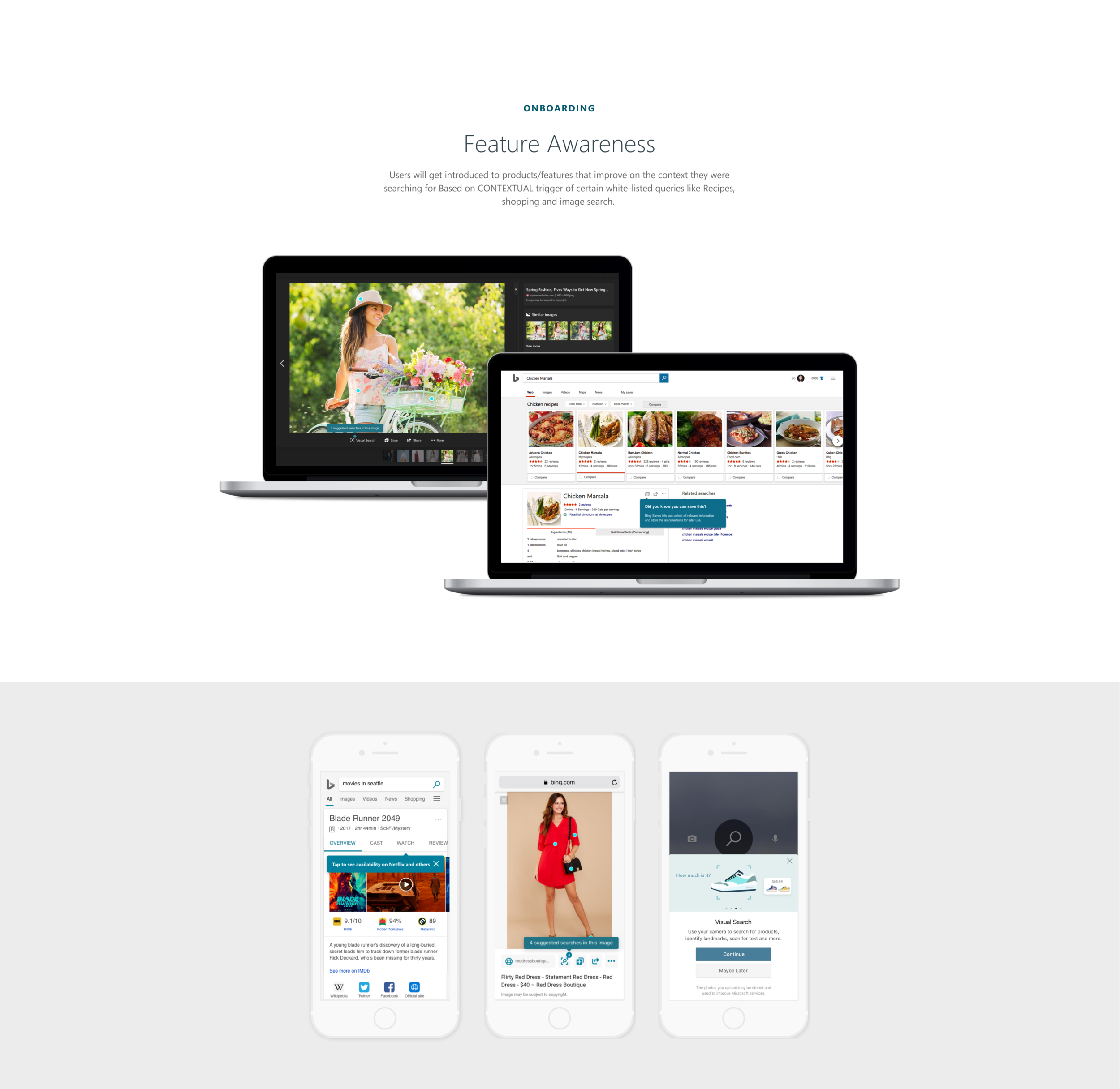
Feature awareness: teaching in context
Feature awareness was the most nuanced layer. Users would encounter product features that improved on the content they were already searching for — but only when the context was right. We white-listed specific query types (recipes, shopping, image search) as triggers, ensuring feature prompts felt helpful rather than interruptive. The message appeared alongside the results, not instead of them.
Rewards and personalization: deepening the relationship
For users progressing from infrequent to frequent, Rewards and Personalization became the primary engagement drivers. The Rewards program surfaced points progress and redemption options without interrupting search. Personalization features — travel mode, interest-based notifications, contextual emails — demonstrated that Bing was learning from their behavior and improving over time.
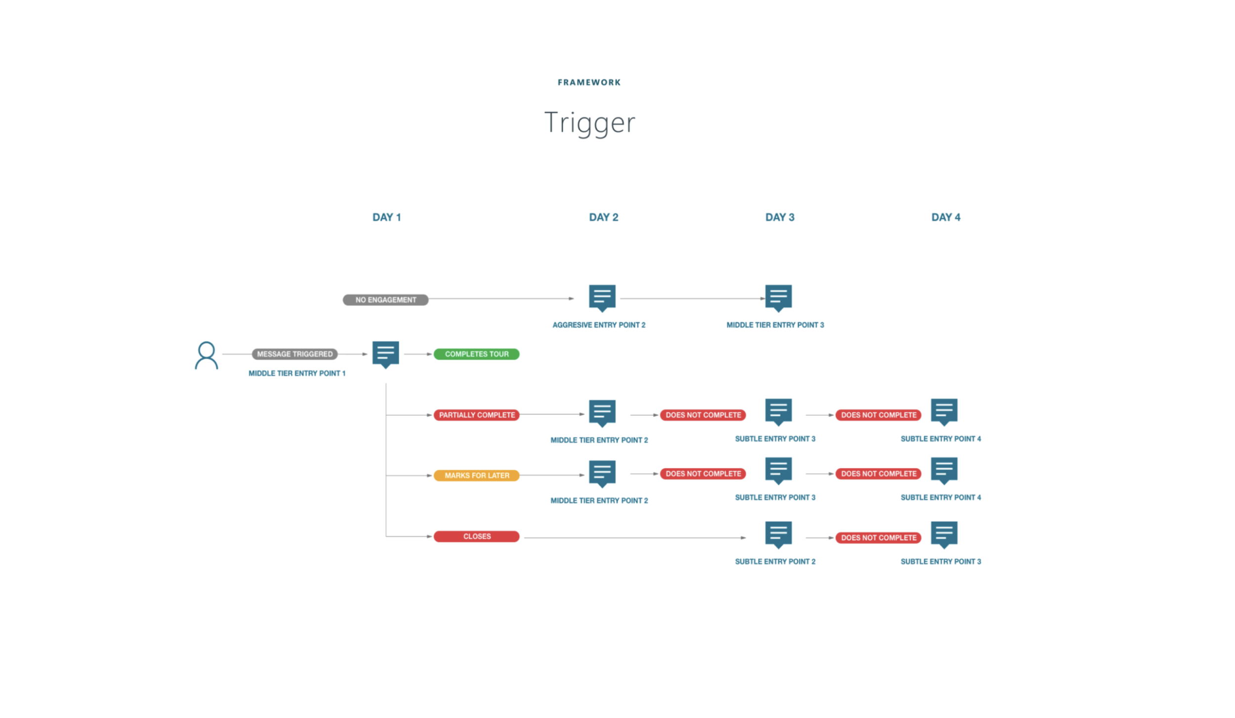
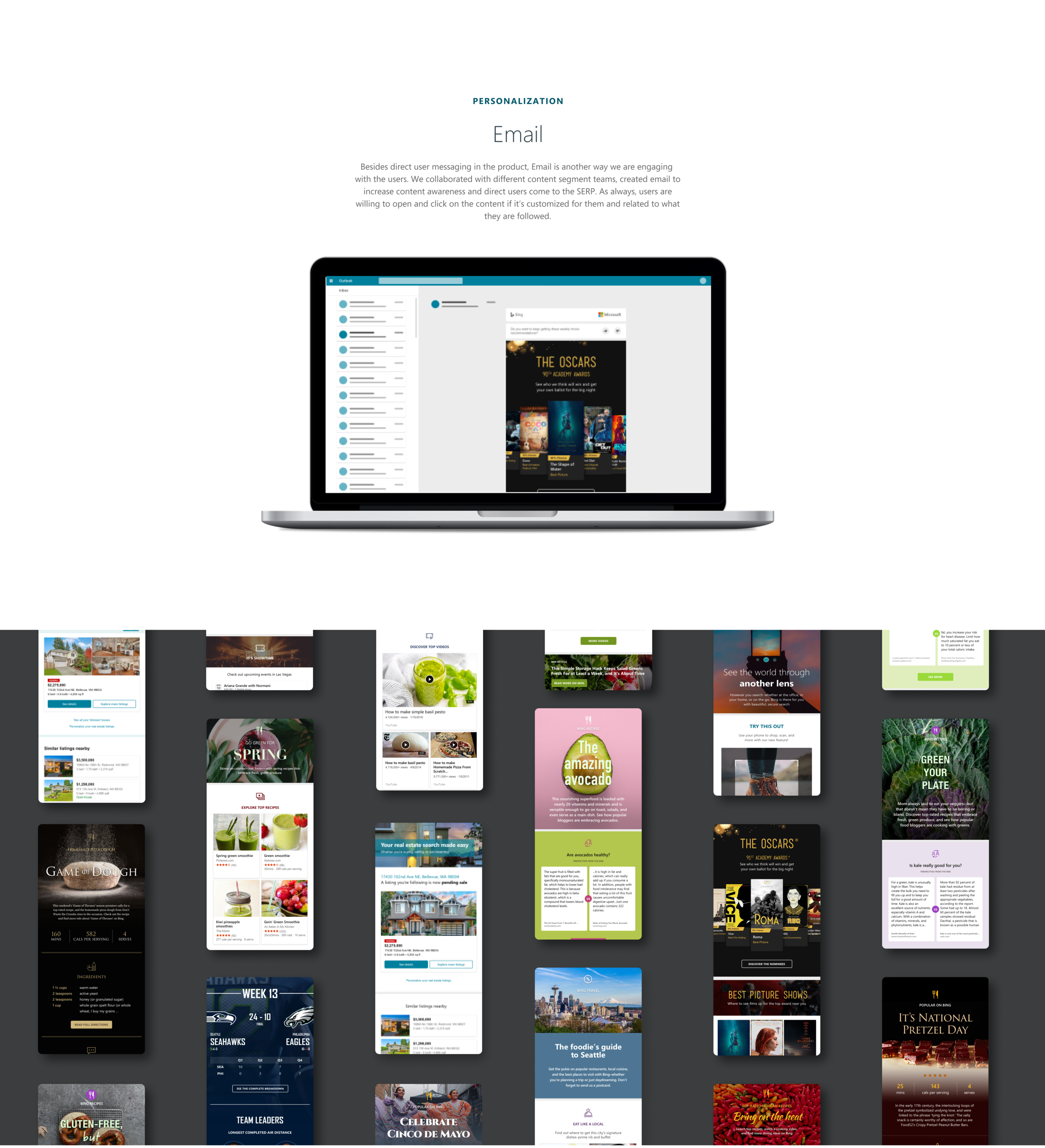
The messaging platform: a trigger system
Underlying everything was a trigger-based messaging platform. Instead of batch-and-blast emails, we designed an automated system that sent the right message at the right time based on where a user sat in the lifecycle. A new user received onboarding prompts on Day 1, feature awareness on Day 3, and a Rewards introduction on Day 5. The cadence adapted to user behavior — if a user engaged, the system backed off; if they didn't, it tried a different angle.
Reflection
This project taught me that the hardest design problem in a feature-rich product isn't building the features — it's making sure people know they exist. And the answer isn't louder announcements. It's a system that understands where each user is in their journey and meets them there with the right message, at the right intrusiveness level, in the right context.
The hardest part was the restraint. Every team wanted their feature to get an aggressive, full-screen treatment. The intrusiveness spectrum gave us a principled way to push back — not with opinion, but with a framework. A subtle gleam isn't less important than an overlay; it's more appropriate for a user who already trusts the product and just needs a nudge.
What I'm most proud of is the lifecycle thinking — designing not just a messaging system, but a progression model that treated user engagement as a relationship that deepens over time. The same user who needs a Welcome to Bing overlay on Day 1 should only see a subtle gleam by Month 3. The system matured with the user, and that's what made it feel less like marketing and more like a product that learns.